Search on Jupiter Money
-
Lead Designer
-
Visuals, Component library & Documentation
-
Mobile
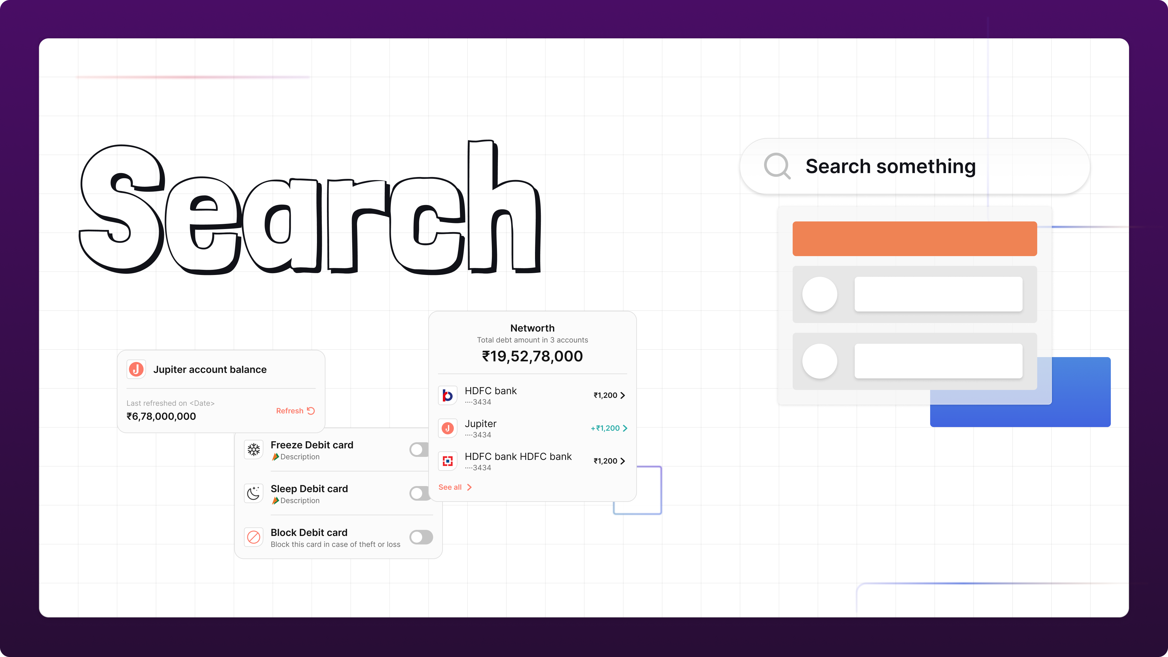
Overview #
Jupiter Money has onboarded more than a Million users on the platform. Being a startup neobank, there are multiple features that are in the roadmap for the next 1-2 years.
We want to be the Go-To application for the users for their banking as well as investment needs.
It was a conscious call to start building search to help the user educate as well as to help them find what they are looking for.
Research #
When I started to work with the search feature as a designer, our challenge was droved by the business need of providing a good user experience when they typed a query for a money transfer or scan QR to see matching results.
Usually, most businesses keep the search feature simple, with a search box input for a query with 1 or 2 keywords and a basic results page, but the universe of the user discoverability with search evolves so much more, and it can be tricky.
“Search is a defining element of the user experience… Unfortunately, it’s also the source of endless frustration. Search is the worst usability problem on the Web.”
As we started the work on our search, I went deep on understanding patterns that are specific for search interfaces that predict interactions and behaviors from users, to help us to build a complete and powerful user experience.
Here’s is 5 whys from a Nielsen-Norman group study about the topic:
- Search requires knowledge of the search space
- Search increases memory load
- Search has a higher interaction cost than browsing
- Specific site search can often work poorly
- Users have poor search skills and don’t know how search works
Navigation is very important because it provides users with a view from what they can find and teaches them about the structure of the search space, what can they search. Showing upfront content that they can recognize substantially improves usability because it reduces their cognitive load.
“Using the navigation categories is often faster and easier for users than generating a good search query.”
This way, through navigation, we can improve usability by reinforcing one important usability heuristic defined by Jacob Nielsen: Recognition over recall.
Scope #
The initial scope was to have the search on the general scope (On the homepage, accessible to every Tab and user), but later on, it was narrowed down to only the “Payment” tab, for now, to first study the users and build our search model with the search string to better prepare for the whole App
Framework #
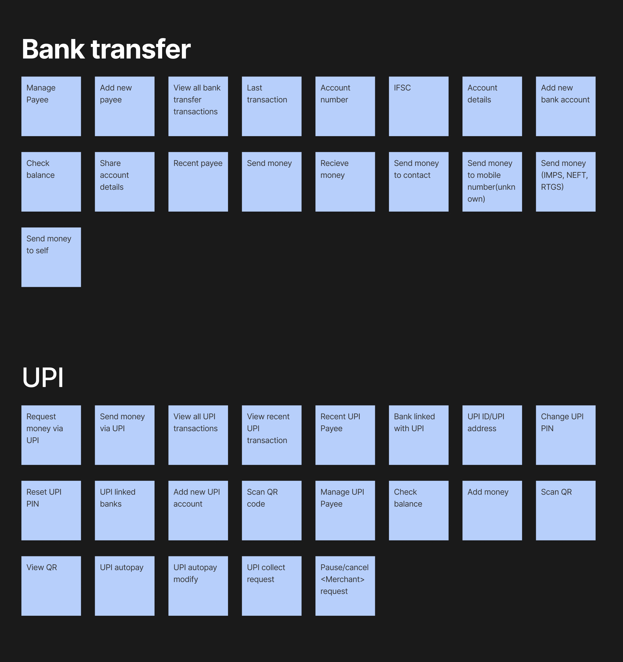
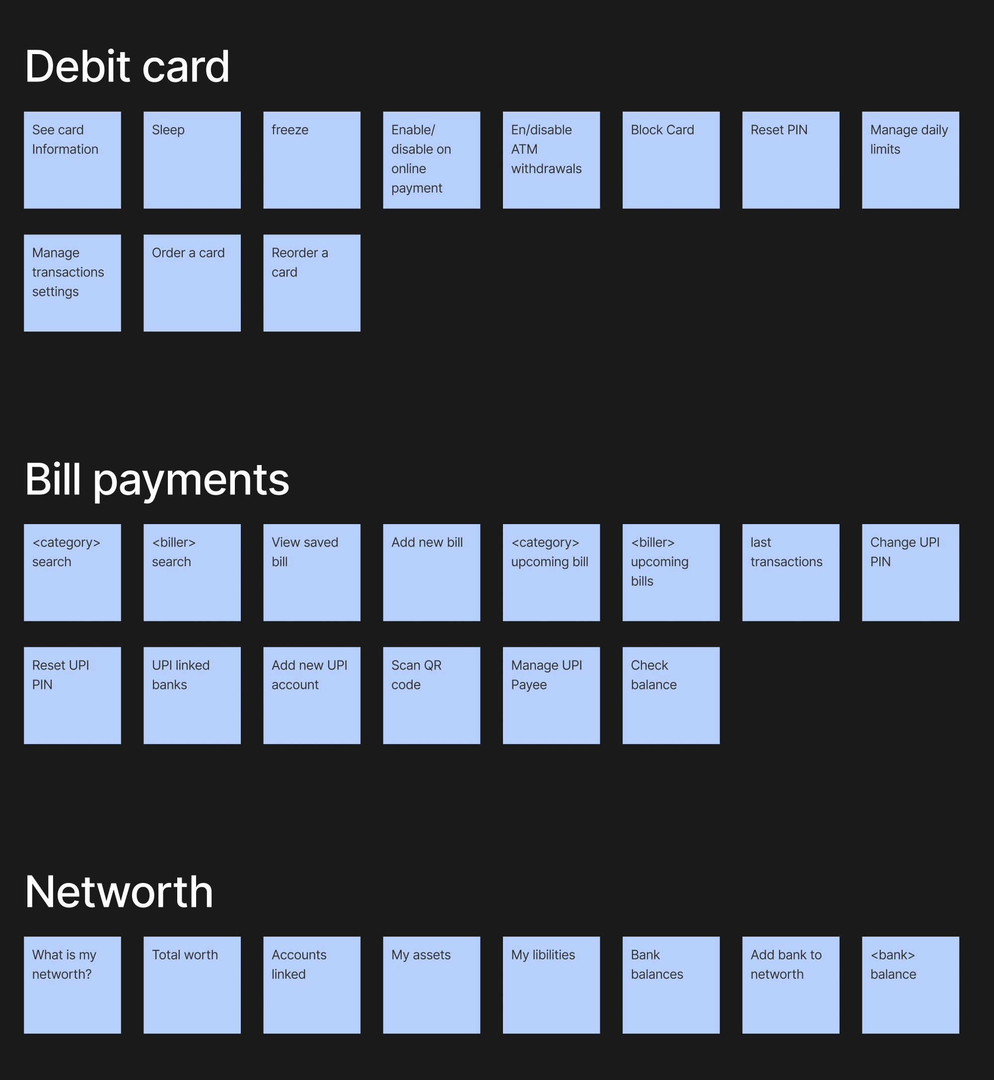
We started with writing down all the intents that we can come up with according to our features, mainly “Bank transfer”, “UPI”, “Insights”, “Money”, “Rewards”, “Net worth”, “Debit card”, “POTS”
After this activity, we started to notice a pattern They seemed to be divided into these broad categories
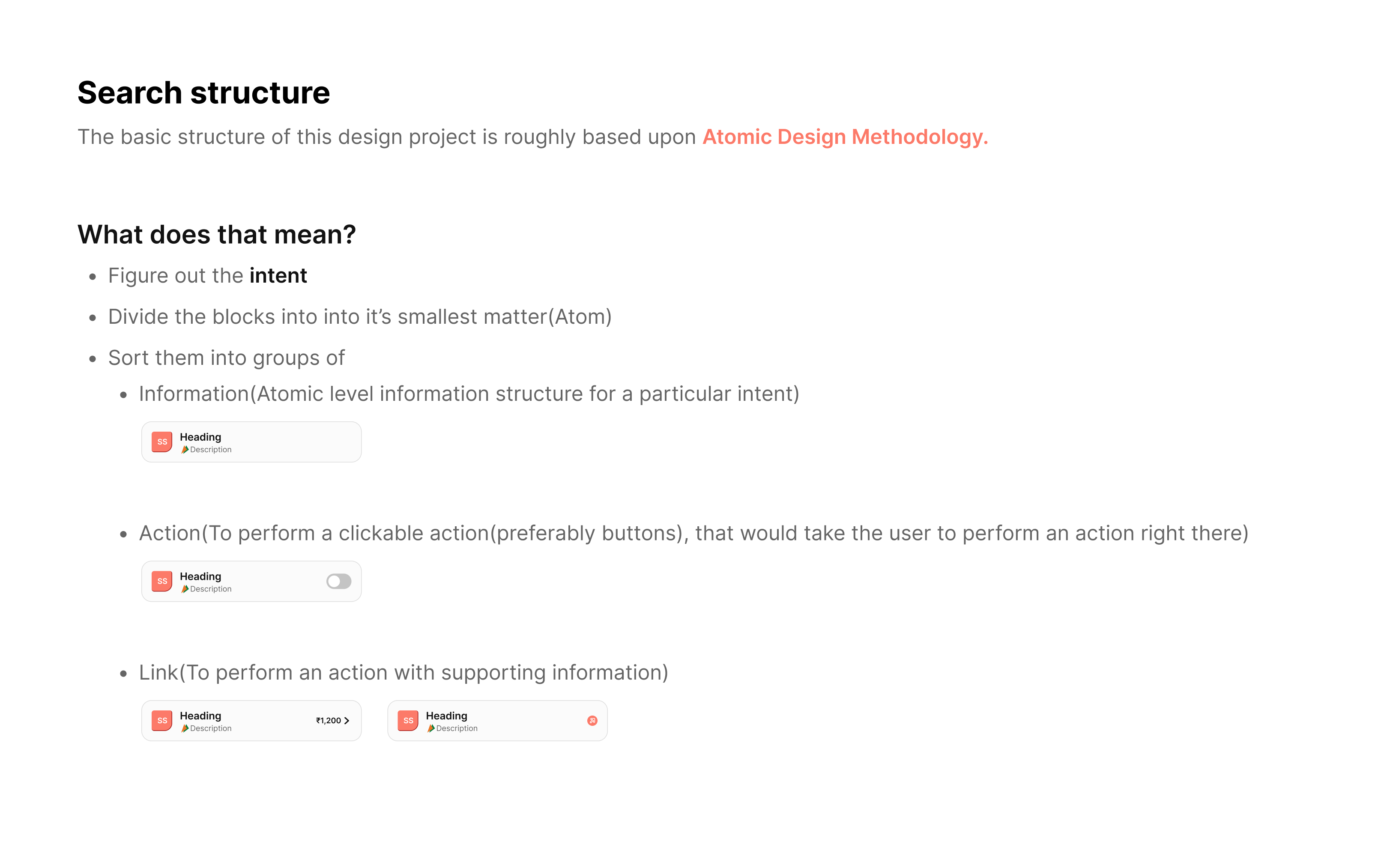
- General information
- Actions
- Links
- Queries
This gave us a starting point to form the visuals. Every intent is now grouped into these categories
Initial Designs #
I started with what the elements would look like when a user searches for anything. I started designing the visuals based on the broad categories that we discussed.
Feedback and structure #
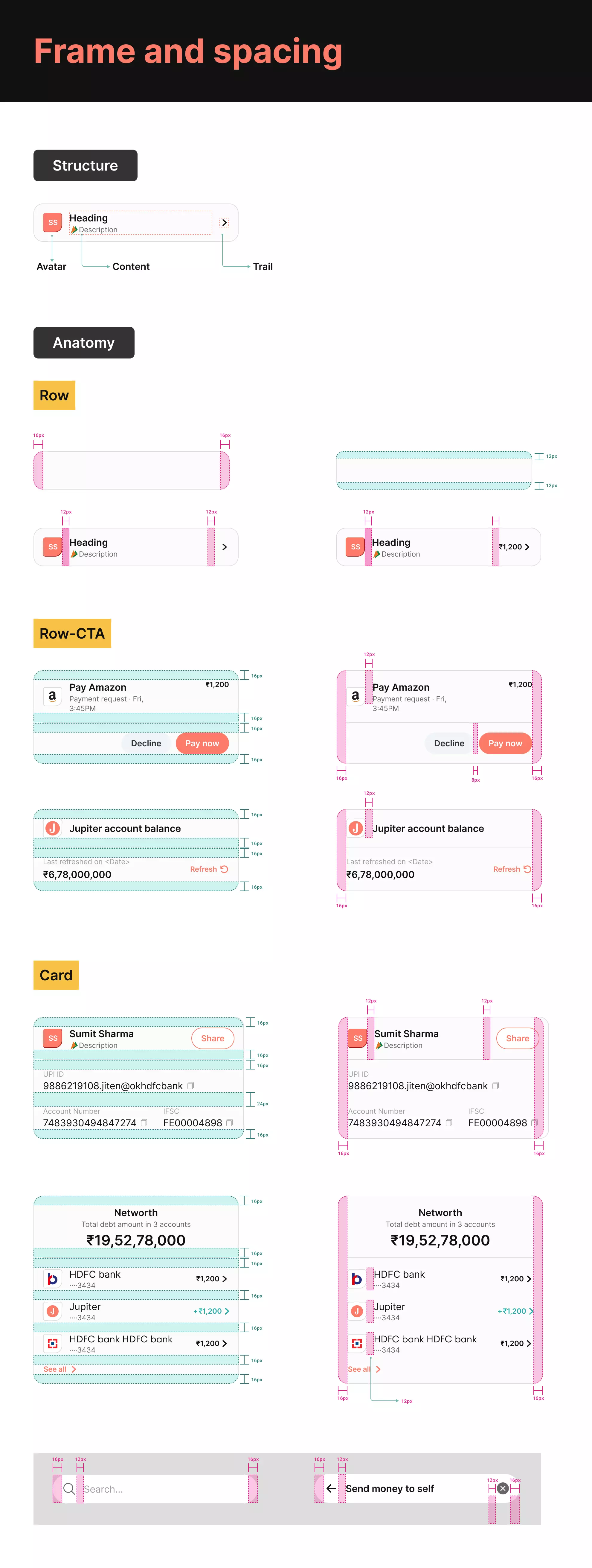
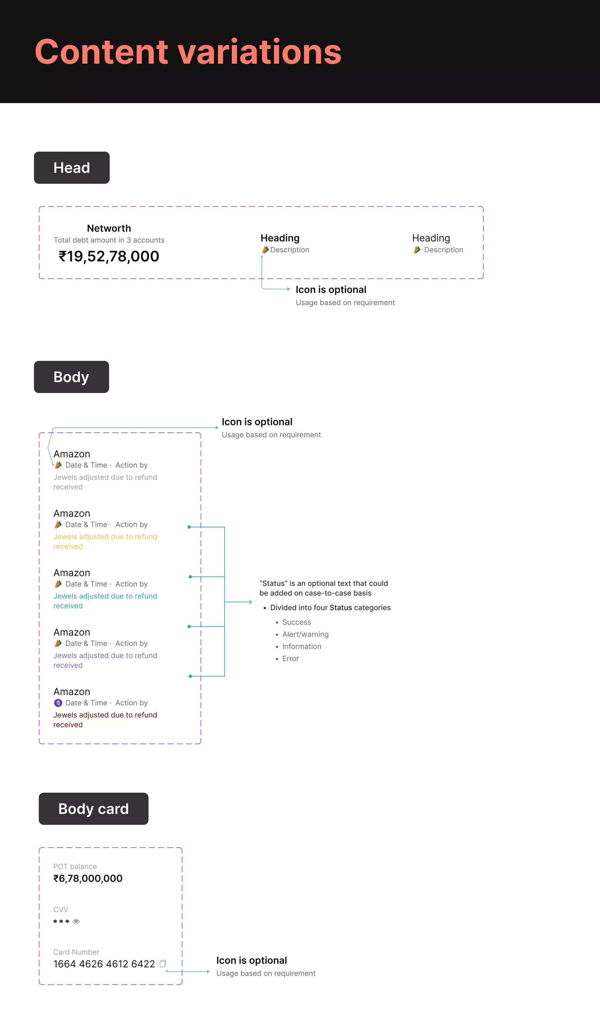
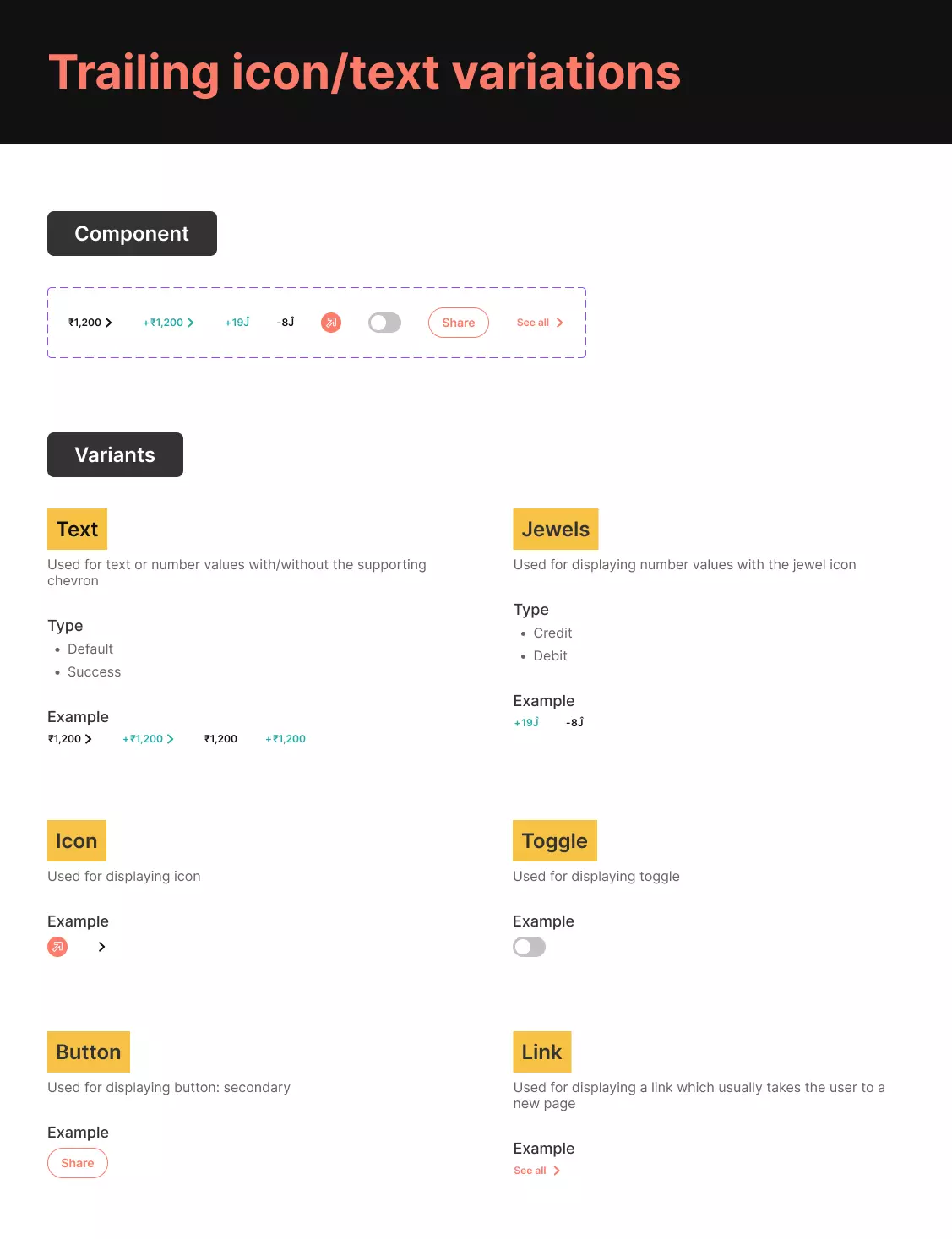
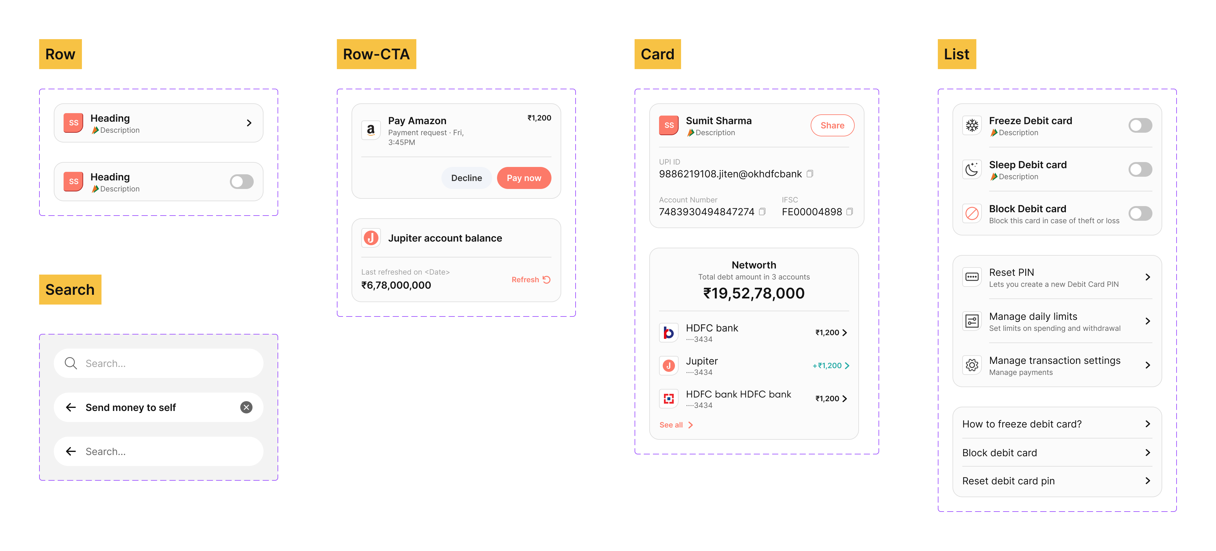
The direction was pretty much refined till now, we just need to make sure that this follows a structure. This was needed as if anybody else wants to continue they should be able to do that without repeating the whole thing.
- How a particular element would look like?
- How would they communicate when grouped together?
- How actionable items would look like?
- What would be the spacing in these elements?
This would also help the developers to follow as they can create templates of the same I followed Atomic Design Methodology for this
In Action #
Next steps #
Yesterday only, this was released on staging server for testing. We would be rolling out to a very small cohort of internal users first to capture what kind of search users are performing.
- Gather data on what should be showed on the zero-state pages
- Analyse and design for any new intent
- Try to replicate this to other features
- Widget based results like: Send ₹100 to Sumit
Widget would help us to make our search “Responsive” rather than being a step by step journey