Portal Design System 2.0
What is a component library? #
A design component library is a centralized collection of reusable user interface (UI) elements—such as buttons, forms, icons, headers, and navigation bars—that are pre-designed, pre-built, and documented for consistent use across digital products like websites and applications
Why is it needed? #
Component library is a part of a bigger design system which is used by alomost every medium to large company to streamline their software development process. It helps in:
Consistency and Standardization: They enforce a unified look and feel across an entire application or a suite of products. By using the same components, teams ensure that the UI is consistent, which is crucial for a cohesive user experience and strengthening brand identity.
Increased Development Speed: Developers don’t have to build common UI elements from scratch. They can simply import and use the pre-tested, pre-styled components, significantly reducing development time and allowing them to focus on the application’s unique features and business logic.
Maintainability and Scalability: If a change is needed (e.g., updating a button’s primary color), the modification is made in one central place—the component library. This change then propagates to all instances of that component across every project using the library, making maintenance much easier and reducing the risk of introducing bugs.
Improved Quality and Reliability: Components in a library are typically well-tested, documented, and reviewed by multiple team members. This rigor results in higher quality, more reliable, and more accessible UI elements compared to individually built components.
Collaboration and Handoff: A component library serves as a shared language between design and development teams. Designers can refer to the components (often mirrored in a design system), and developers implement them directly, ensuring a more accurate translation of design mockups into code. This smooths the handoff process and reduces communication overhead.
Objective #
The objective of this project is to upgrade the running library so that component can be updated with newer properties and can be better maintained in the longer run.
Current state #
While browsing through the component library and updating the component on regular support work, I have encountered a few issues:
[Issue 1] Majority of our current component design structure is based on figma’s old DS structure #
This was a major release back in 2022, but our components were never updated with respect to this update
This lead to component level issues like:
Unable to scale a component in the right manner
New variations were added in a redundant manner
Even to add an icon to a component, the whole component design was repeated to achieve the desired result
TLDR; Figma’s latest properties were not leveraged to create best version of a component
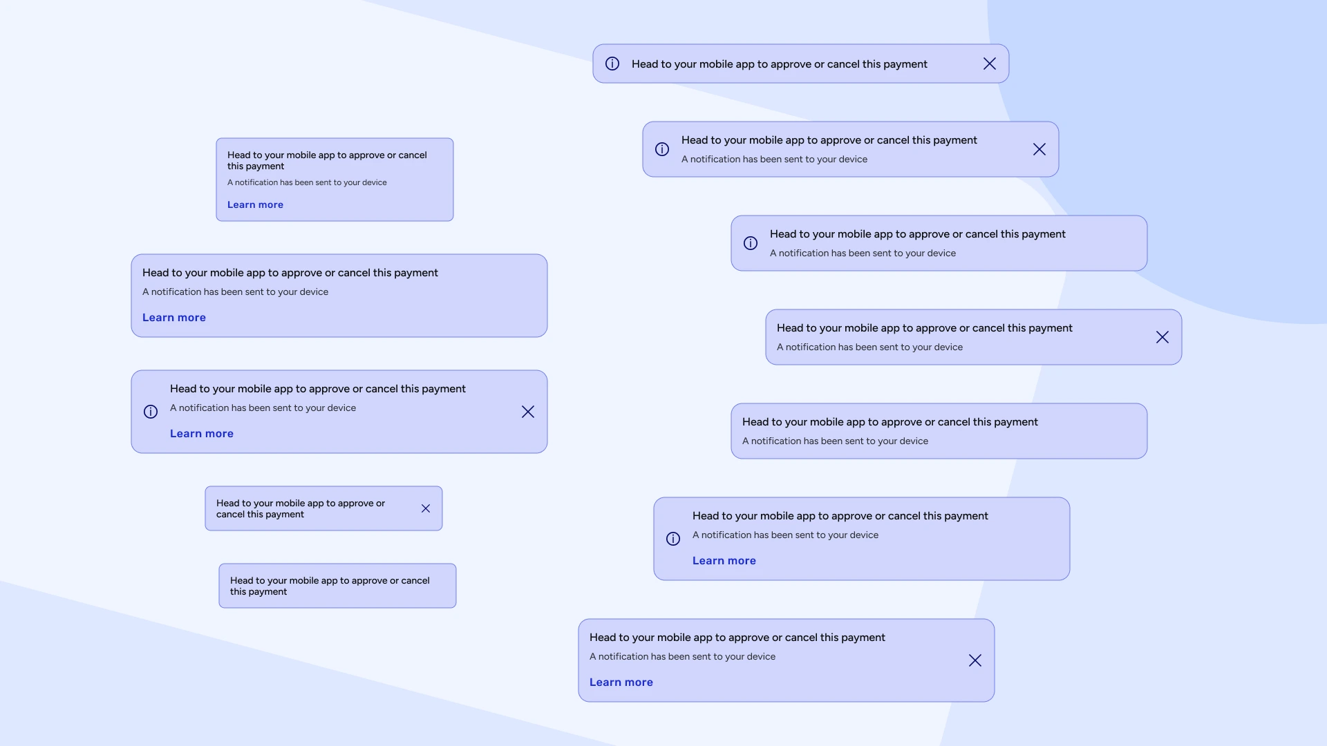
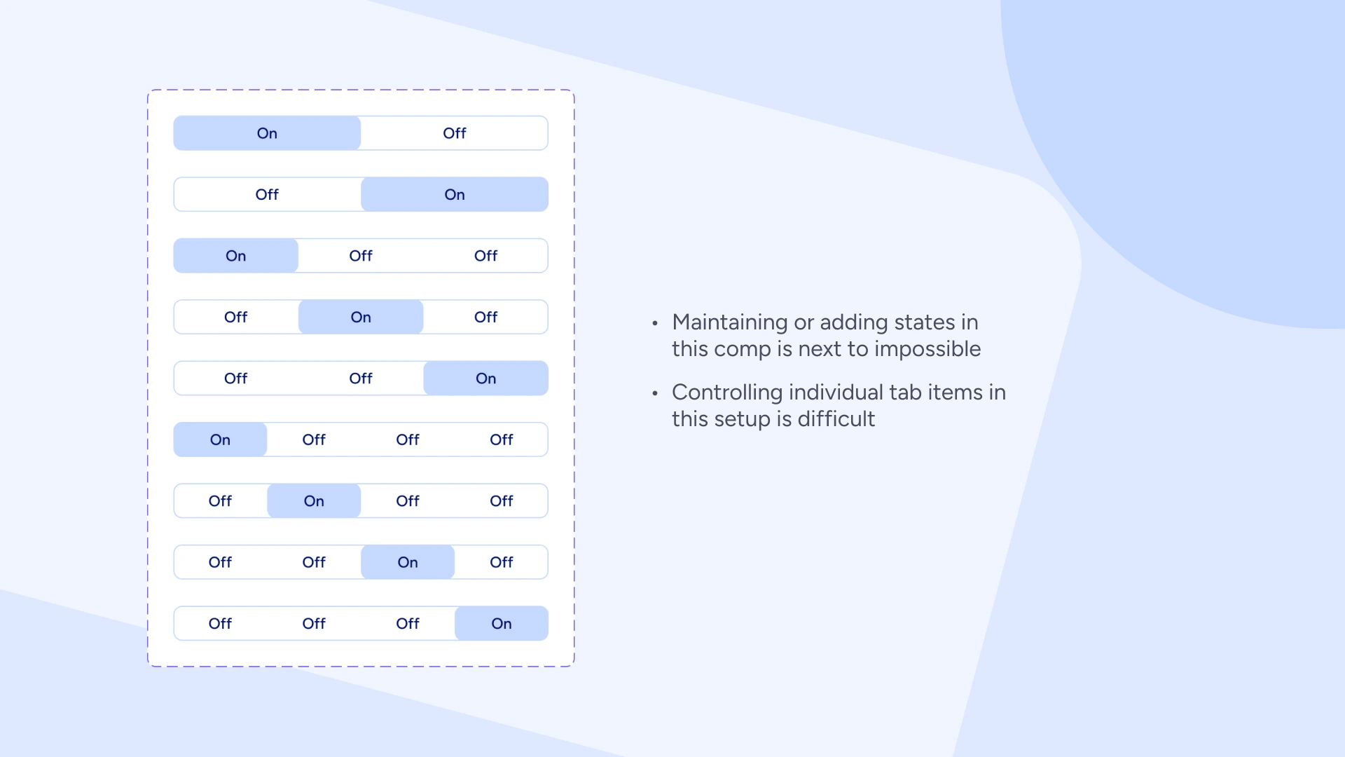
Example of this structure (Banner):
It is overly complicated
State like success is missing
Even to add a button or sub-heading, a new repetitive variant has to be created
Adding anything new to this comp is a headache
Unnecessary UI variants making the component more cluttered
Too complex
[Issue 2] Our component structure #
Because of the current structure of
Cross-platform
App
Mobile
Little or no focus is given to the WEB side of things
This lead to structure level issues like:
While searching, a designer won’t know that If the component is available for every platform
Most of the component weren’t designed keeping web in mind while they are being designed initially
When a component can be maintained and designed with all platforms in mind, why the division?
Eg: A well designed table component for data update & display is still not available for web. List component is used which is not the best component to display data on web
TLDR; Overly complicated component/file structure
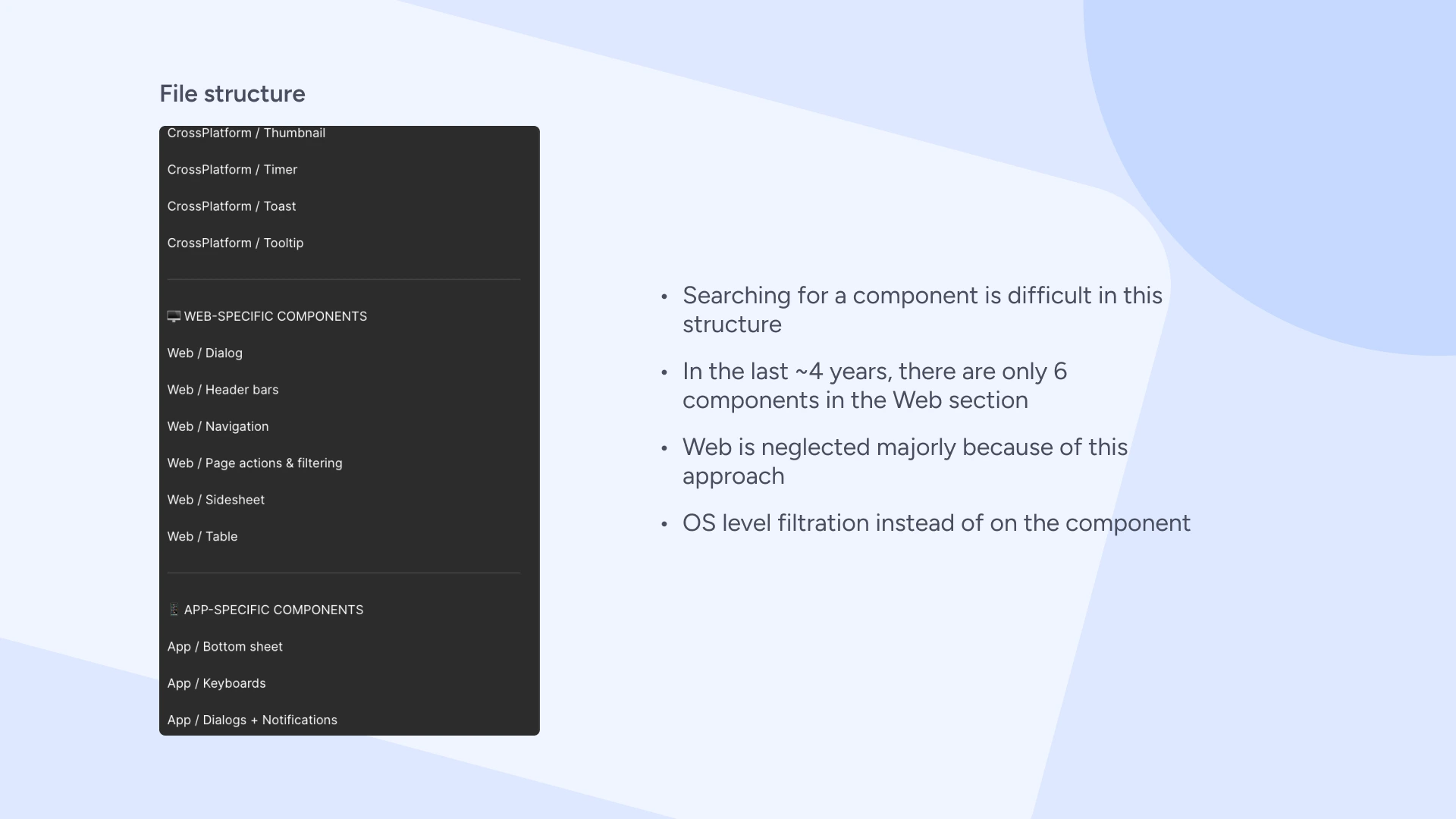
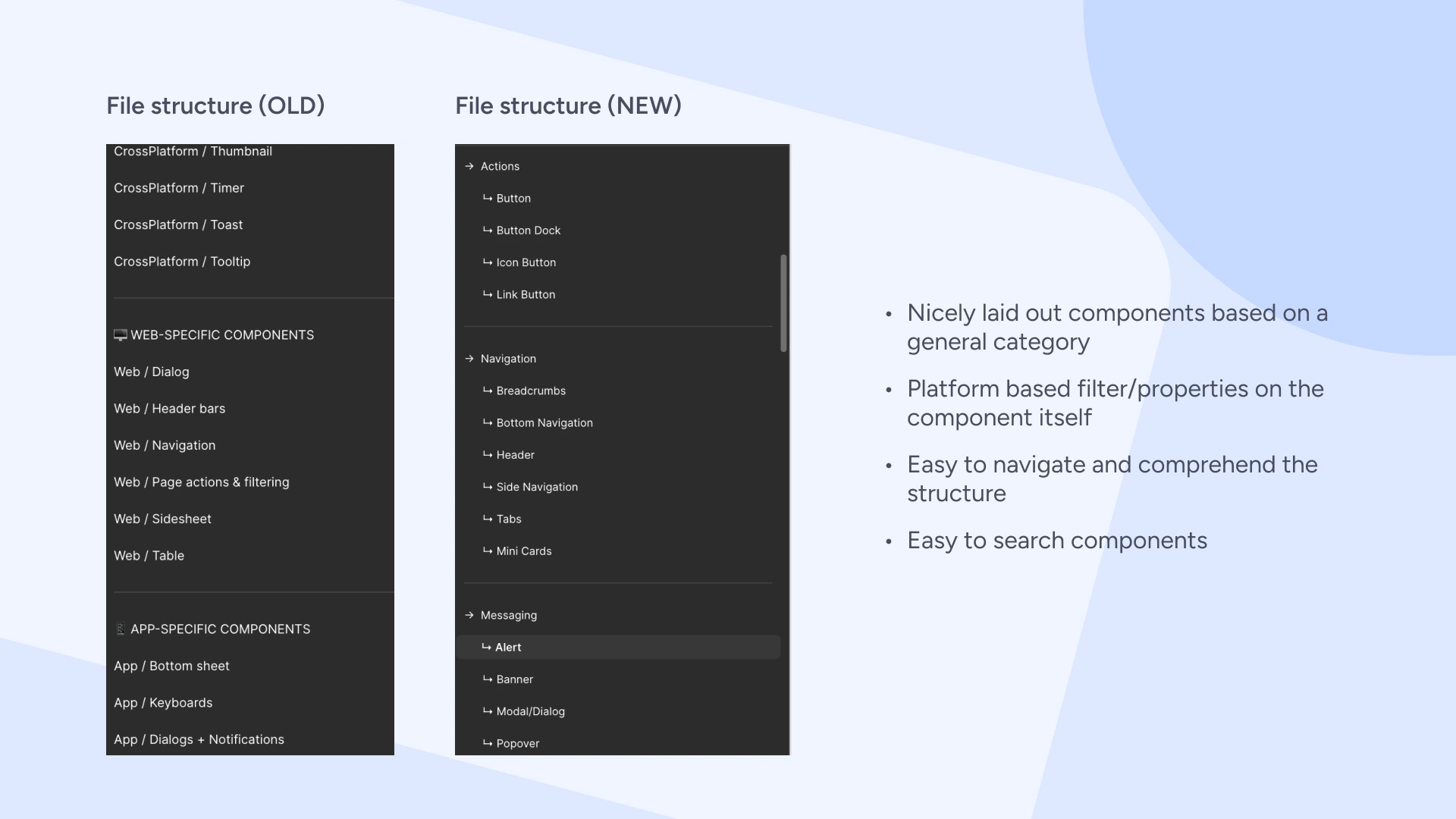
Example of this file structure:
Web based components are not in focus at all because of this approach
Structure shouldn’t be this complicated
OS level filtration should be on the component NOT on the structure level
Atomic level component are missed because of this
[Issue 2.1] Our component structure #
Non-related components present on the same file
This creates search issues and you always have to remember where the components are.
A lot of manual work is required just to find where the component is
Examples:
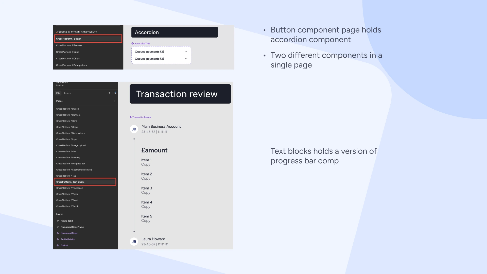
Components like AccordionTitle is present in the Button component file
BSMenu is present in Input component page
BusinessName is present in List component
Web / Page actions & filtering is an unnecessary component present in our system
Dialog/app is a component which is NOT designed right and needs to be update and many more
TLDR; Incorrect categorisation of components
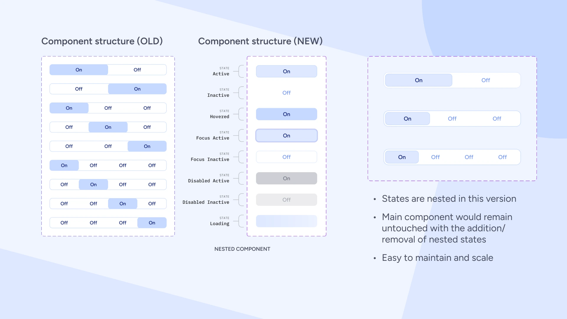
[Issue 3] Absence of local component structure in some complicated components #
Issues with this gap in components:
Management of the components is affected when their is no local one is present in complex components
Redundant variations have to be created for simple and small iterations
Eg: Segment control, tabs, bottom navigation
TLDR; A complex component like segment control should be designed from a nested component to maintain the states and design of the main component.
Business impact #
At the moment, there are 104+ components in our library which are divided between App, Web and Cross platform
Anonymous google sheet questionare with the designers indicated that it’s a little difficult to find what they are even looking for
Majority of the components are missing some of the basic and important properties which are needed for all platforms. This eventually raises support tickets and multiple to-and-fros between the designers, developers and the Design System team
Time taken by the Design system to even update a component increases by 2x since the old structure prohibits adding anything without repeating oneself. DRY (Don’t repeat yourself) is need of the hour here
These delays impacts about 8,00,000+ Indian members and 5,00,000+ UK members
Plan #
I saw and experienced this issue when I joined Tide.co 2 years ago. Since I was new at that time, rather than completely re-doing the entire component library, I decided to start small and build on things, and feedback presented before me.
Small start/win #
I picked up some prominent components and started updating them based on the use-cases and the properties that were missing from them. I also updated their structure so as to make the maintainance of the component easier for present and future use-cases. The components that I re-designed were: Button, Banner, Segment control
The number of support queries went almost half and the complexity of the components reduced which meant design system team’s work speed almost doubled
This little experiment gave me the confidence to try this exercise to the wider and overall component library
Bigger picture #
In one of the townhall meetings of 2024 with the leadership, I got to know about the future plans of tide and that’s when I decided to perform the little experiment on a larger scale so as to support the upcoming timelines of the features that would be offerred and the direction company is taking
Q1, 2025 #
I formally discussed this with the wider team and it was added as an OKR
Formal Plan #
I decided to setup a new component library to counter the issues of component and structure upgrades. And started the planing how it should be done? Pushing updates or making changes to old library vs new library
For that reason, I created a comparison table between creating a new library vs updating the old one
Transition to New system library #
| Pro | Con |
|---|---|
| Clean Break = No Legacy Baggage You don’t need to update or fix old, inconsistent component instances — the old library can remain untouched for legacy files while the new one sets the future standard. | Loss of Old Component Connections Old designs won’t auto-update with improvements from the new system. They’ll either need to be left as-is or updated manually if revisited. |
| Instant Access to Updated Components Once published, the entire team gets access to new, standardized components from day one — no need to wait for staggered updates or approvals. | Initial Migration Takes Time Moving components from the old system to the new one requires planning and time, especially if there are many dependencies or active projects. |
| Avoids Complex Merge Conflicts Creating a new library avoids the technical risks of merging design files, which in Figma can lead to lost overrides, broken variants, or nested conflicts. | |
| Simpler to Adopt Gradually Designers and developers can start using the new system project-by-project without having to refactor existing designs immediately | |
| Better for Training and Onboarding - A clean, well-structured library is easier to document and teach than a legacy one that’s been iteratively patched over time. |
Managing releases on existing system library #
| Pro | Con |
|---|---|
| Single Source of Truth is Maintained - No need to track two libraries or switch context. Existing projects stay connected and updates can technically be applied in-place via instance updates. | Technical Complexity of Merge Conflicts - Figma lacks robust merging tools, and maintaining an existing library with updated branches introduces conflicts, overwrites, and broken components. |
| Lower Immediate Overhead - Teams don’t need to manually swap out libraries or components. Only instances need updating — assuming everything merges correctly. | High Maintenance Overhead - Keeping the old system up to date requires continuous effort: precise merging, cleanup, renaming, and testing across files. |
| Inconsistent Behaviour Across Projects - Even after merging, instances across different files/projects need to be manually updated — increasing chances of inconsistencies or broken UI. | |
| Nomenclature Conflicts - Updated component names or structures (e.g., separating Banner into ProductBanner and AlertBanner) may break compatibility with existing usage patterns. - Eg: A new comp (Alert) has been added. This has to be replaced by the current versions of banner in our running designs - Context: Currently we only have banner as a comp for product & alert messages. The newer setup divides them into TWO separate comps | |
| Figma Debt Will Accumulate Further - The more patches and updates you apply to an old system, the more “figma debt” builds up — slowing teams down and risking further divergence from the design vision. |
TLDR;
Can’t do the changes in real time
Branch should be created and changes should be made
Since, changes are of overall and component level. Multiple merge conflicts, If pused to the same library
Even after resolving conflicts, a new component has to be created for all individual comps
Which means old instances are destroyed and manual updates are required for already running comps
Outcome #
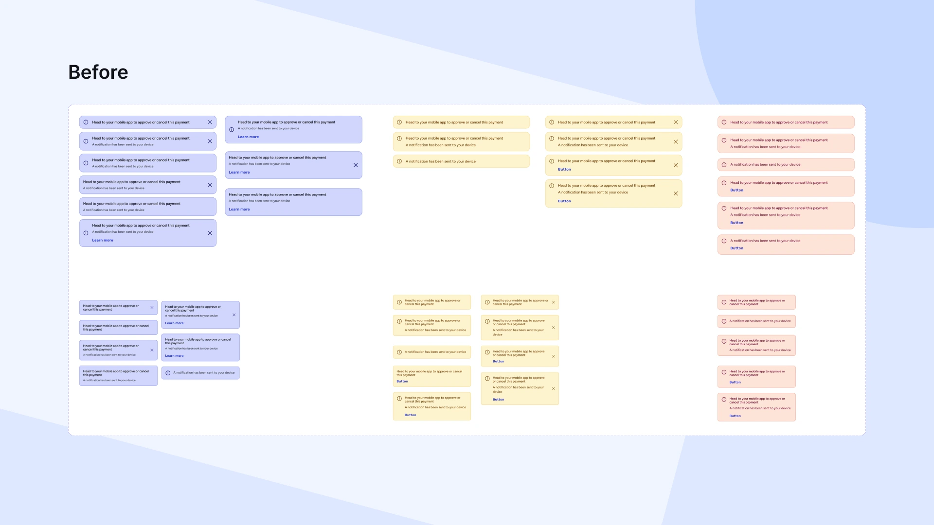
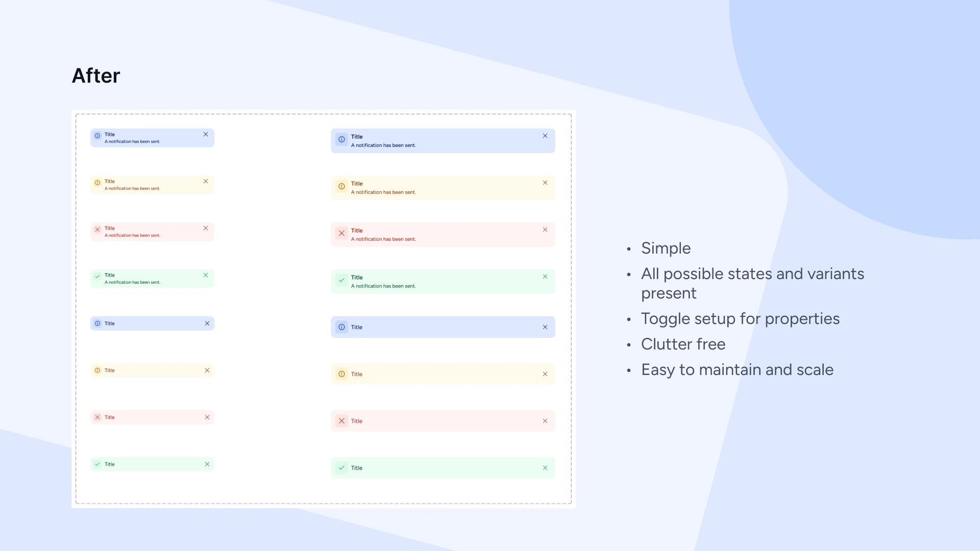
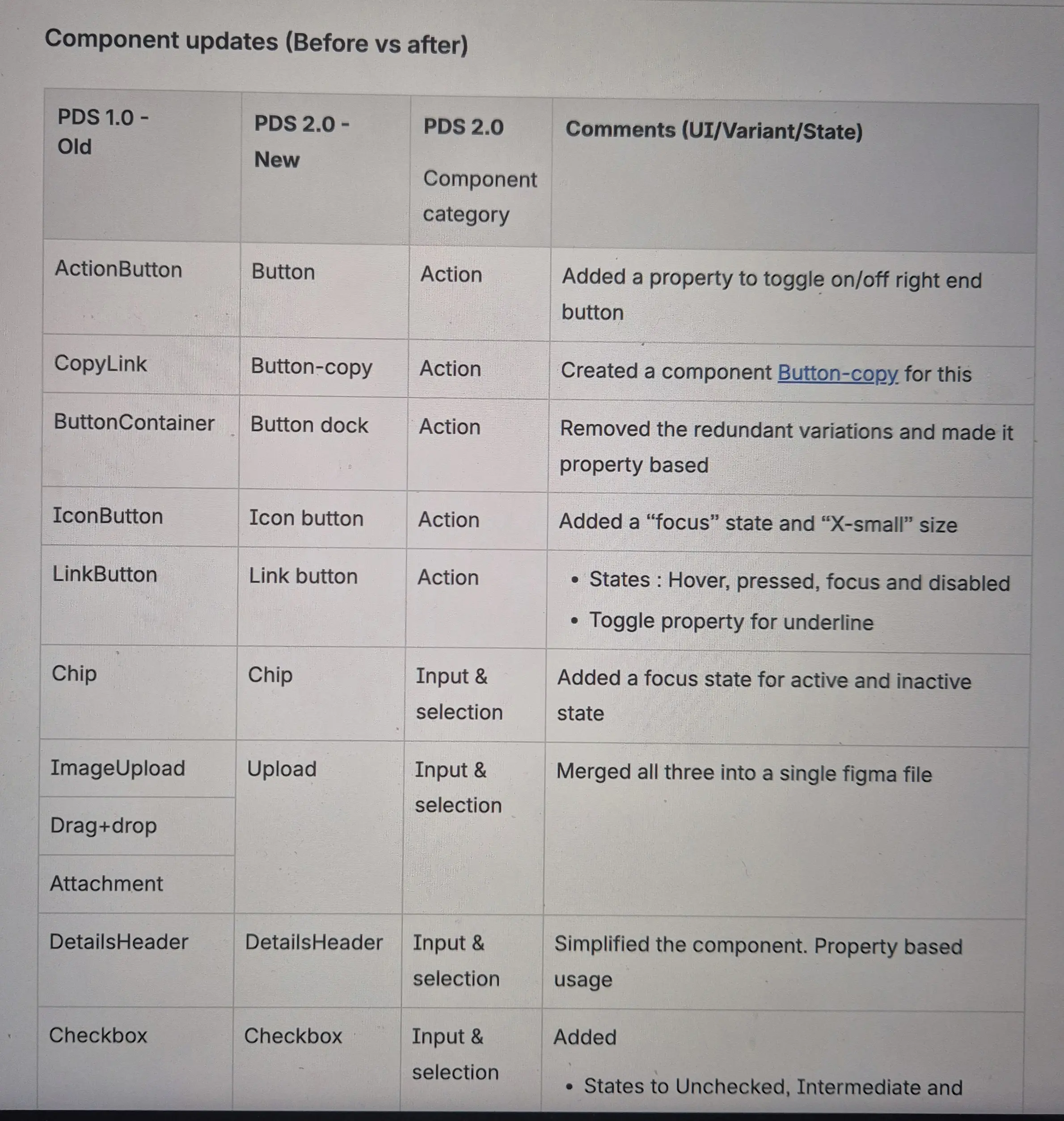
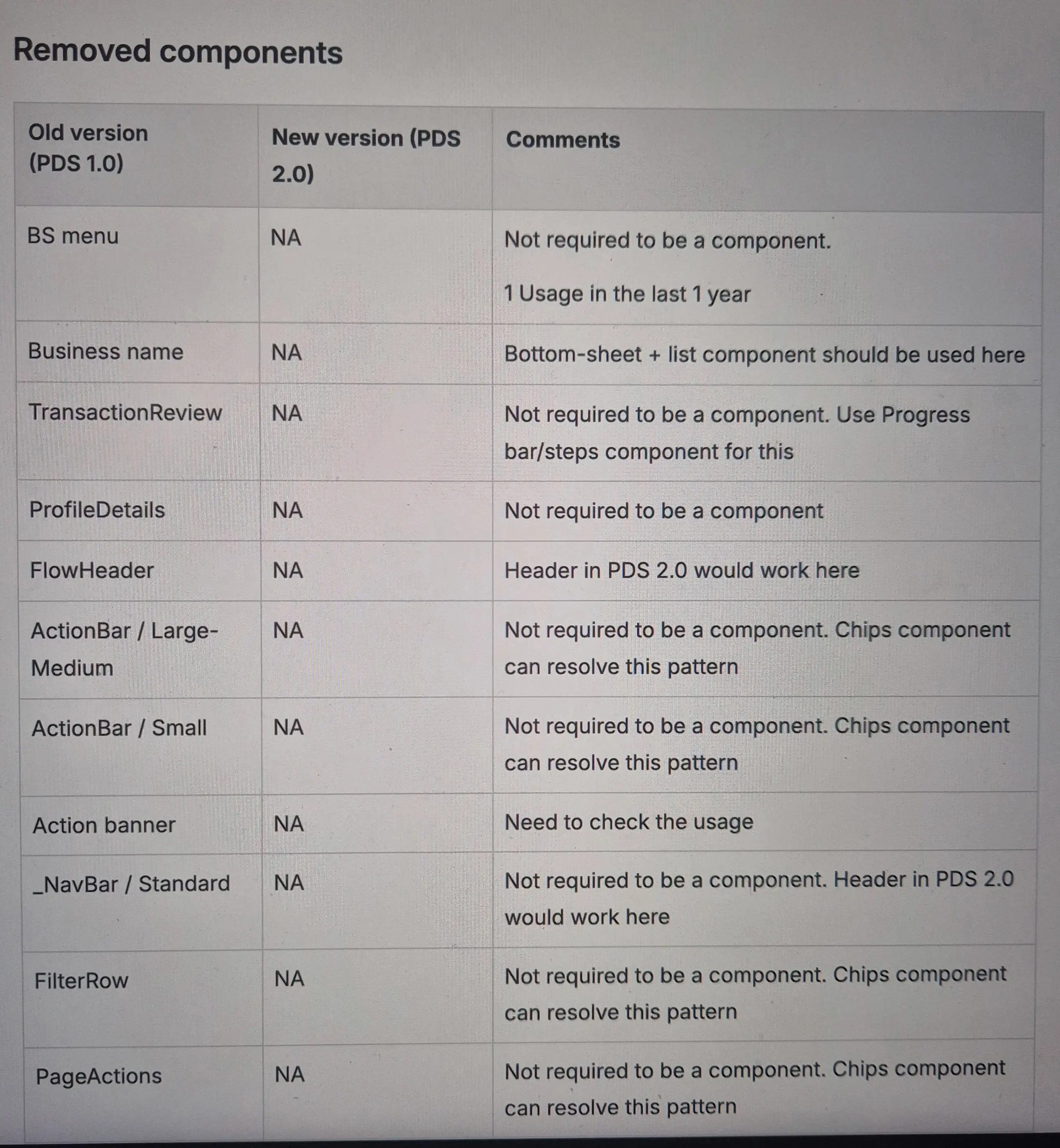
Here are some exapmples of the changes that I did (before and after)
Design communication and migration plan #
In our weekly design meetings, these updates were shared with the whole team and “Why” we are doing the changes.
This exercise would:
Let the designers know what to expect exactly
Why we are doing the update process
How their current files would be impacted
Enable the designers to share their feedback on the component designs as well as the documentation
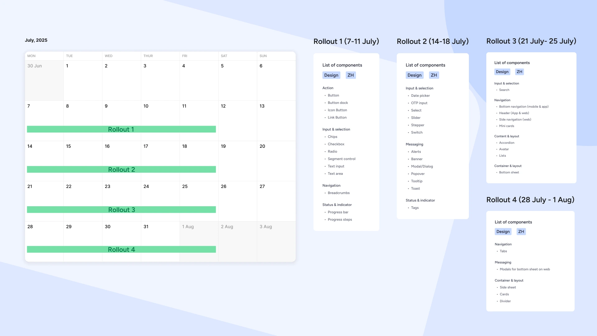
Roll out plan #
- Component design updates are first rolled out to the DS developers
- This is done to accommodate the changes first on the dev side so that when rolled out to the designers, their workflow isn’t disturbed
- Rollout to the design side should be a ONE go to avoid any confusion and multiple to-and-fros between teams
- Onboarding guilde was constructed for the designers to make them familiar with the new library
On a common team call, a document was shared which includes #
- Why this exercise was done?
- What are the exact changes to the components?
- What are the depreciated or merged components?
- Timelines for date of library publish and deletion of older library with support deadlines
- All the new library components to play around with
- What they are expected to do in this file?
- Component rollout to the developers is co-ordinated according to the table below
Early outcomes #
Already 50% reduction in number of components
Did a test with some of the designers to re-construct a particular pattern with new and old list component. Turns out even with proper onboarding to that component, designers almost took the same time but shared a common feedback that it is easier now.
Added video onboarding for complex components after this feedback