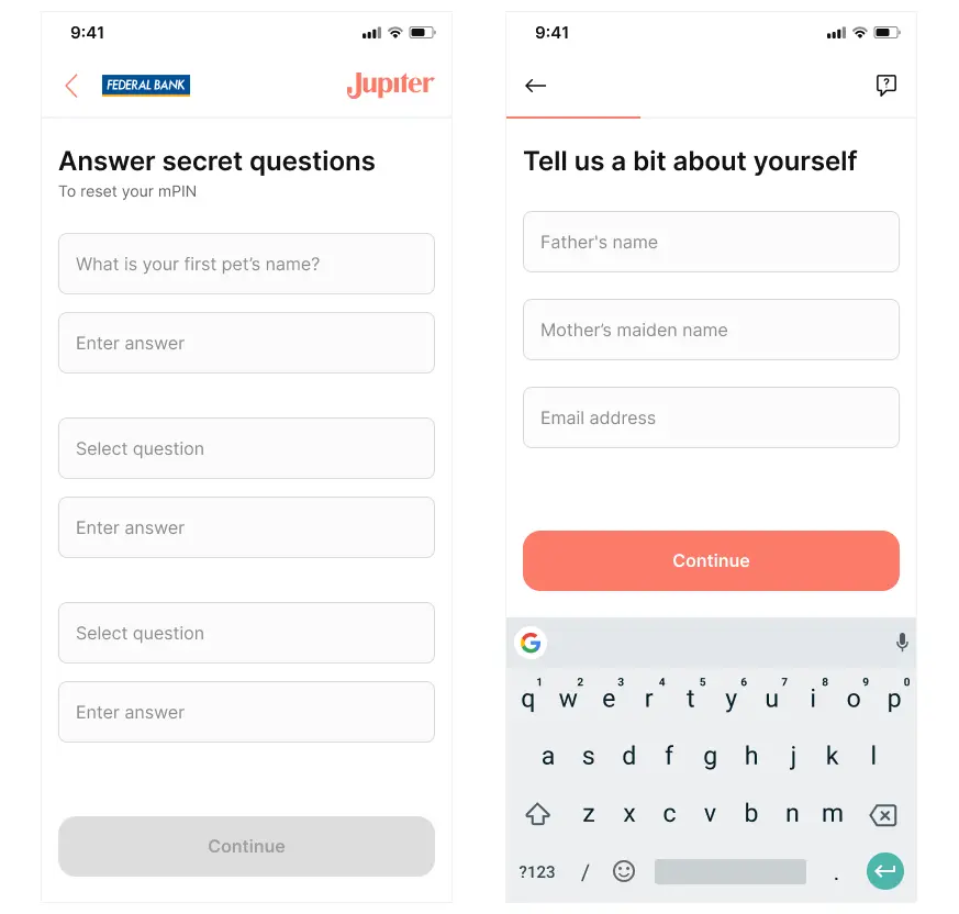
Input Component
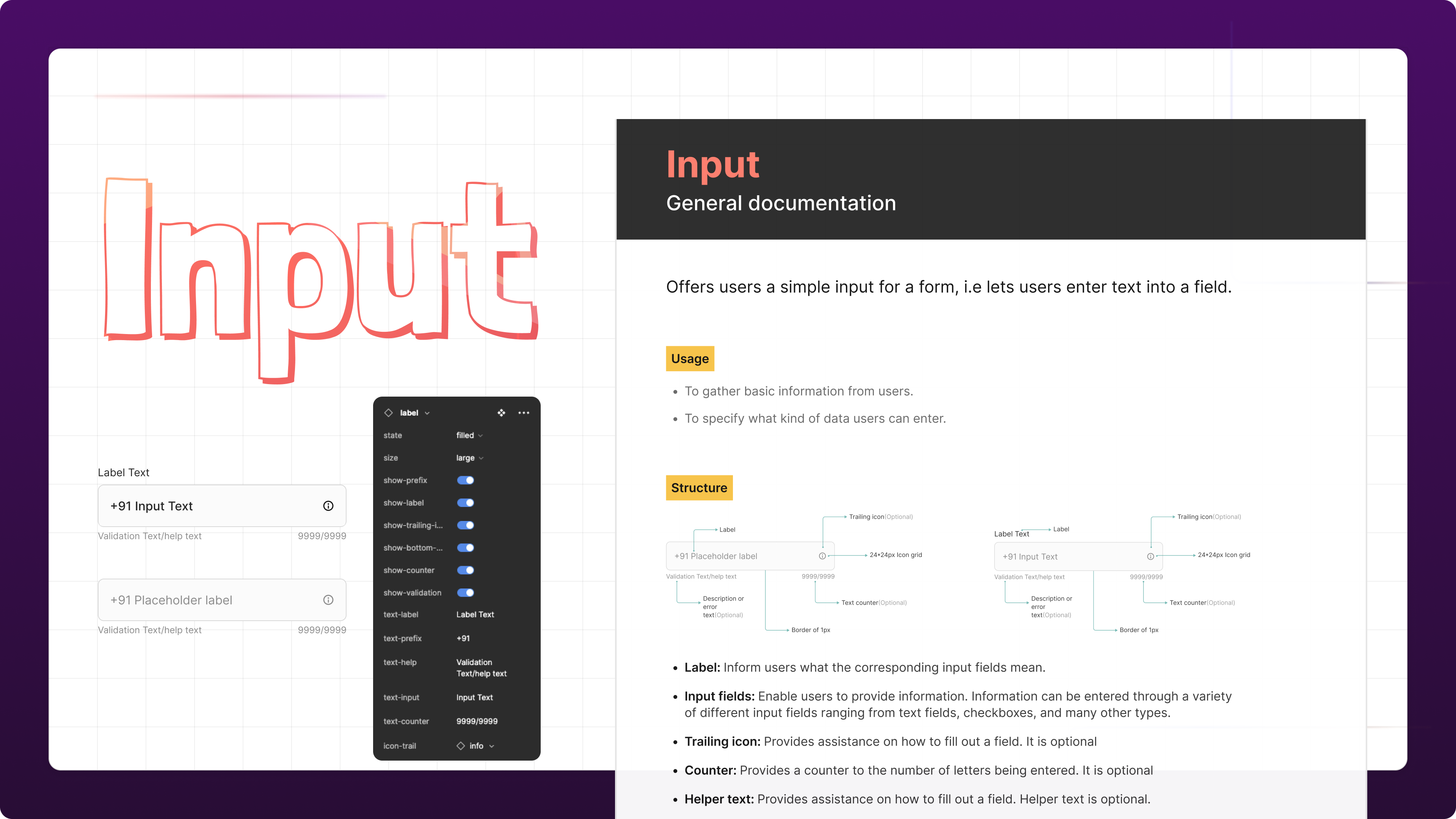
Project #
I joined Jupiter Money in 2021 November at a time of expansion. The company is on a roller coaster ride since its launch and now with multiple new products in the roadmap, It felt right at that time to improve the app’s experience through a more systematic approach to product design.
Till now, the team was working with a sticker sheet. It had gaps that need to be filled, but I was amazed at the scale and speed with which features were rolled out.
The leaders as well as the team felt the need to have a dedicated Design System so that we’ll reduce our TAT, engineers work better with the designs, and we reduce the redundancy in the code as well as in the designs.
I believe every product has some design system, even if it’s not acknowledged, documented, or truly systematic.
My process to design and release a component to a design system #
Generally, the process is divided between two paths:
- When you are designing from scratch
- When you are redesigning something
This is a redesign project, i.e. going from a UI sticker sheet to a dedicated, proper Design System.
One of the component that I undertook was “Input”. When I was using this component in other designs, I noticed that It doesn’t have a common UI, no proper error handling, and It is being used in multiple different ways across the app.
This was creating a “consistency & functionality” issue in designs as well as in Development.
After consulting other designers and conducting research, I decided to try a new component to overcome this issue.

When building a component, you need to think about quality, the design of the component, and also the needs of the product and how you’re going to use it. Practice and collaboration help to make the process more interesting, rich, and effective. The process I used at Jupiter Money is based on what I’ve learned with this article from the Nathan Curtis, from EightShapes, Atomic Methodology by Brad Frost and whatever I have learned till now.
Here are the steps:
Plan & Discover #
- Definition of scope
- Component research and auditing
Design #
- Explorations and reviews
- Accessibility research (this one phase happens during the previous one)
Build #
- Design Specs and Figma component build
Documentation #
- Usage guidelines and documentation
Ship it! #
- Publish component in Figma and repository
- Release notes and communicate
1. Plan & Discover #
When building a component (or anything, really), I like to start by finding as much information about the issue as I can. At this phase, it was important to understand user journeys, scenarios, why we need it, what it is to do. So I did an Audit of the component
When will a user interact with this component?
- What is the user trying to achieve with this component?
- What is the user’s mood when using this component?
- What does it do, and what doesn’t it do?
- What should be the states associated with this component?
- What could be the possible properties of this component?
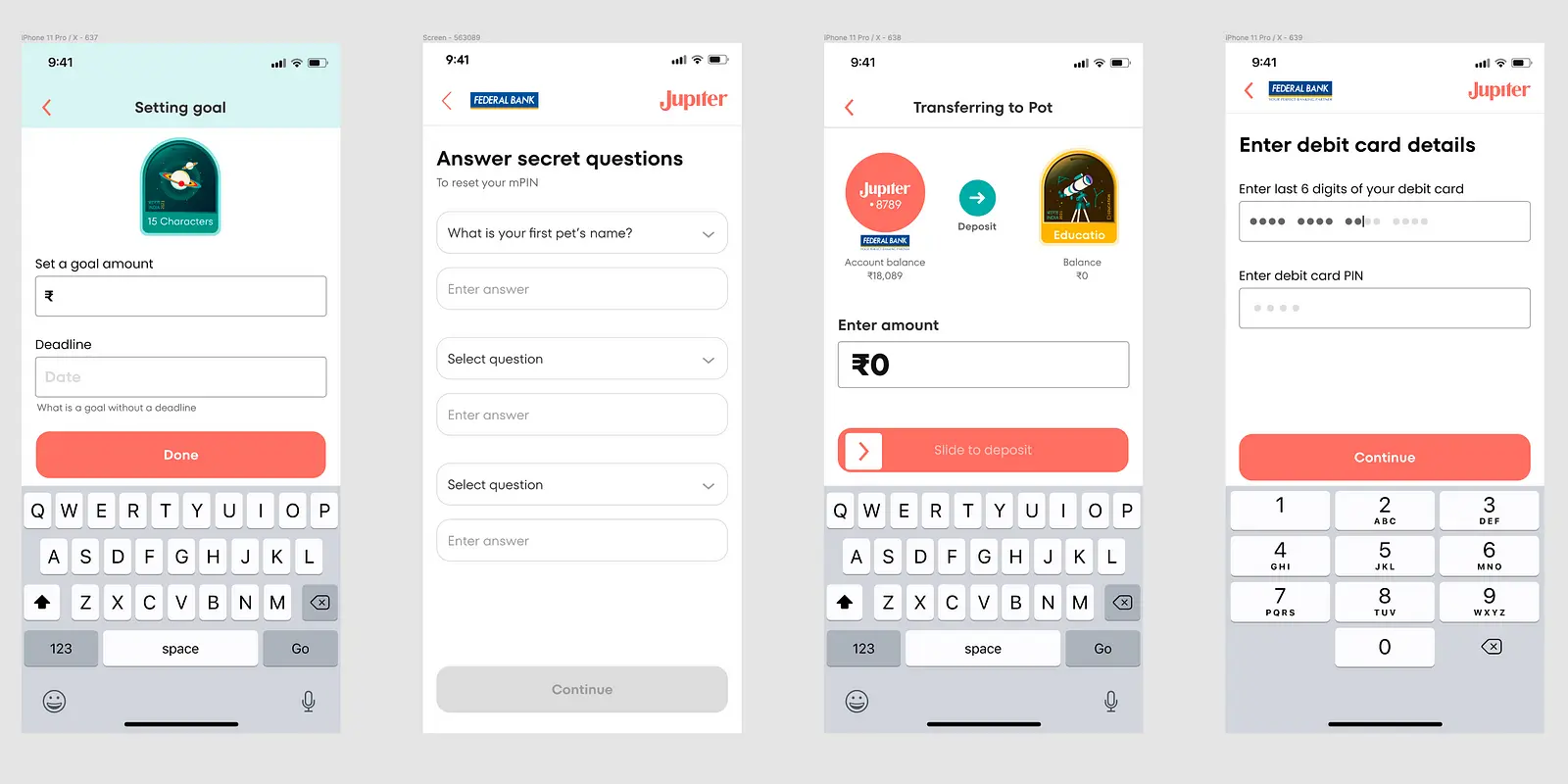
Jupiter Money often used the “Input” component in Onboarding flow, feature pages etc. While auditing, I found multiple different UI for the same thing and no proper state management
I then consulted other designers to see if there were any use cases or properties that are currently missing. Immediately, I encountered interesting, valid use cases.
Examples: #
- Option to add Icon on the trailing end
- A counter (numeral) option at the bottom end of the Input
- Maybe a different variant for label inputs
- Different sizes
- Option to add/edit Prefix
2. Design #
Component research and auditing #
Now that I knew what this component could do, I also had a pretty good idea of what issues it could solve. At this point, I like to seek how other design systems are building similar components. It’s nice to include engineering at this point, to start reviewing API, reduce constraints, getting tips on how it should work.
A great surprise was to realize that other design systems had the same component I originally thought about and, based, on the usage guidelines, they had similar problems as well.
I like to check the component Gallery because it is a great way to find components, as it lists a lot of them and other names they may go by.
Design explorations and reviews #
Yay! Figma’s time! Since I knew a lot about this component and how it worked, it was time to have some fun at Figma.
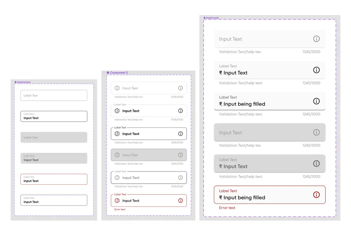
I like to build a full version of the component, including all properties it may have, and then break up in parts and states. This way, I can figure out the properties and smaller parts, a.k.a. nested components, I will use when delivering the final component to the Figma library.
It was time to gather feedback.
I’ve presented the component in our design weekly (meeting with all designers) and asked for considerations and how they would use it. Another presentation was made to some engineers and PMs to gather feedback as well. Engineers always deliver great contributions! Rely on them.
Accessibility research (this one phase happens during the previous one and the next one) #
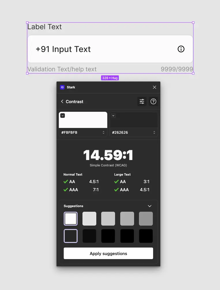
While designing is crucial to review the component to attend to minimal accessibility requirements. I checked contrast, readability, and interaction to assure it was OK.
Hint: The best knowledge on this is by reading the WCAG guide and using Figma plugins such as Use Contrast and Stark.
3. Build #
Coding #
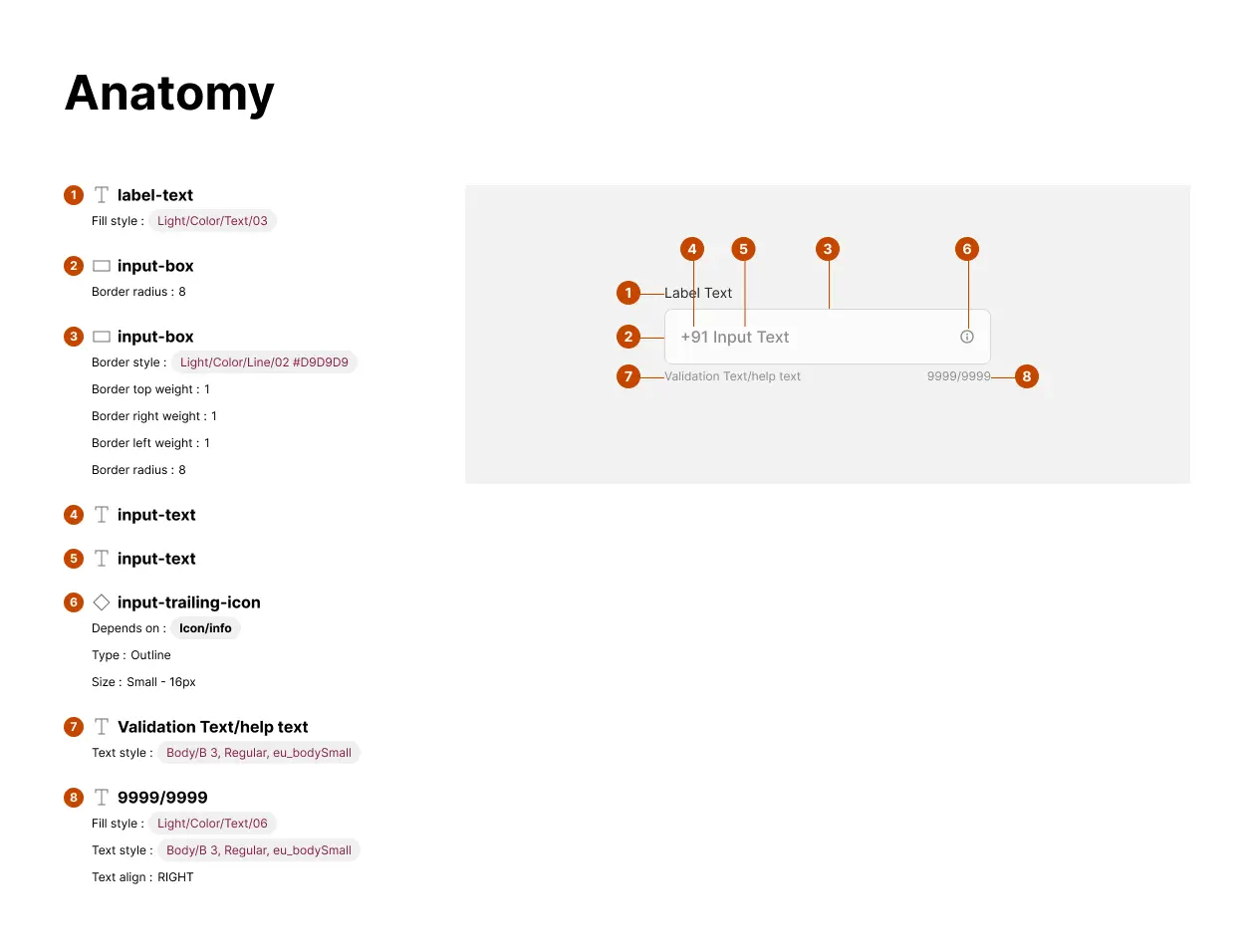
The design spec is the hand-off artifact that I provide to the engineers. Here it’s important to list all states, as well as the tokens used to build the component. During this process, there is also QA to assure accessibility compliance standards are being researched and built into the component or documented to provide guidance where we are unable to imply them through the API.
Figma component build #
For the final delivery, I have also to provide the full component to be published in our Figma Library. Remember what I said before about properties and variants? Every so often, it’s hard to figure them out…. In fact, It can get really crazy, considering the complexity of the component or how many instances are needed.
I set the properties considering the mandatory and optional props, as well as the types of Inputs. I also choose to use a nested component for the internal part of the alert, so any future update would be done across all components with easiness.
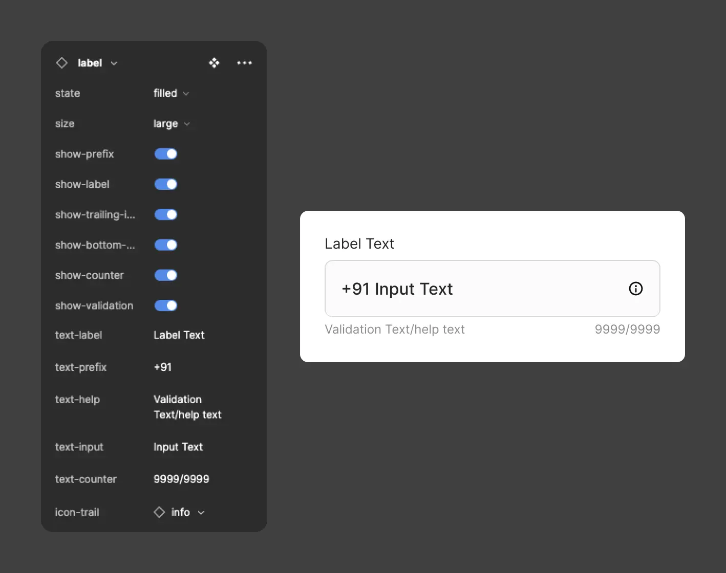
Likewise, I’ve tried to duplicate as much of the properties engineers used in the Figma properties panel as possible. This enables engineers and designers to have a common language when interacting.
Naming properties #
I followed a basic principle of naming Boolean properties staring with “show-“ and content properties starting with “text-“ The instance swap properties started with “icon-“
I also used the beautiful plugin EightShapes Specs from Nathan Curtis for Technical documentation. It’s a great tool to define the Anatomy, spacing properties very easily.
Handy Tip: Do name your layers before using this tool, you’ll see why 😆😆
After the hand-off, the Engineering team started to build the component to be published in the Storybook.

4. Usage guidelines and documentation #
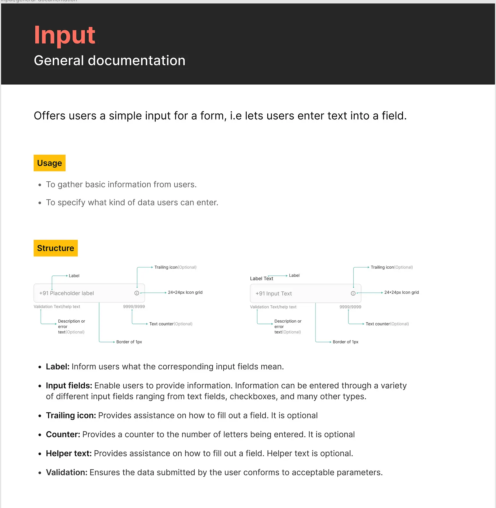
Along all the process, I’ve gathered information about the usage of the component. So, it was time to put it together with the content team’s help.
5. Final checks and ship! #
One final, but essential step is the shipment, that includes not only making the component available in code and Figma, but also widespread communicate about it. It’s time to update release notes, post to slack, have a demo with the team (designers and engineers) so every interested part gets to know about it.
