Europa - Jupiter Money’s Design System
-
Lead Designer
-
Component library & Documentation
-
Mobile
Overview #
I joined Jupiter Money last year in November at a time of expansion. The company is on a roller coaster ride since its launch and now with multiple new products in the roadmap, It felt right at that time to improve the app’s experience through a more systematic approach to product design.
Till now, the team was working with a sticker sheet. It had gaps that need to be filled, but I was amazed at the scale and speed with which features were rolled out.
The leaders as well as the team felt the need to have a dedicated Design System so that we’ll reduce our TAT, engineers work better with the designs, and we reduce the redundancy in the code as well as in the designs.
I believe every product has some design system, even if it’s not acknowledged, documented, or truly systematic.
A design system is a complete set of standards intended to manage design at scale using reusable components and patterns
Before digging my teeth into improvements, I needed to know what we were working with. I did an audit of the components, visuals, icons, patterns, etc. that we were using.
Resource Audit #
My first step was to figure how we were organizing and implementing our current sticker sheet. I talked to the current designers and had 1–1s with developers to find out what they were using in day-to-day work. We have:
- There are some components which are build in React Native, some as web components
- No, or little component documentation, like a Google doc about when to use different kinds of warnings
- Some features are developed on WEB platform
- Reusable variables are used, but they are not maintained very well
UI Audit #
It’s inevitable for a startup to catch up with the speed by which features are developed and as a result, many variants of components were designed and developed.
Even though we had these components and a little knowledge of guidelines, it wasn’t clear how they were reflected in the UI.
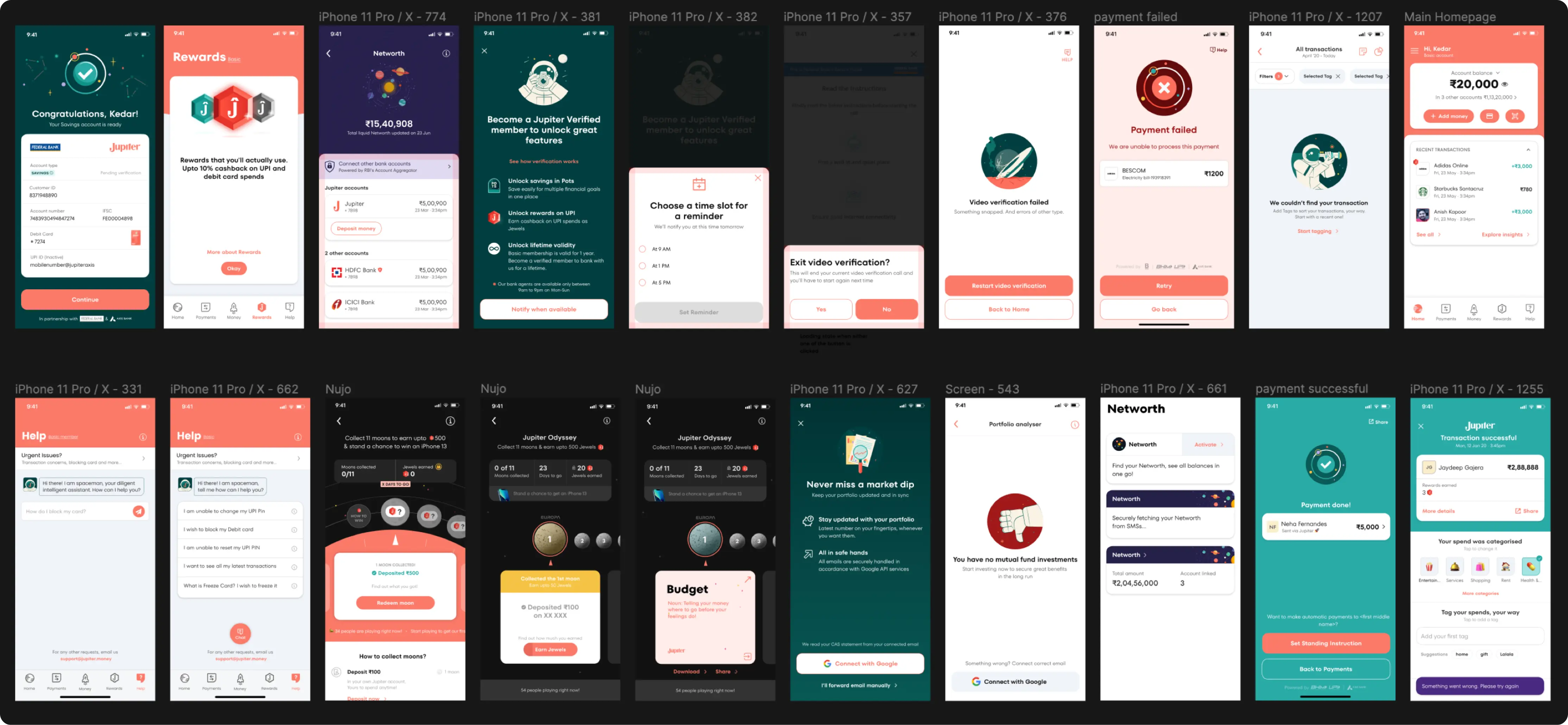
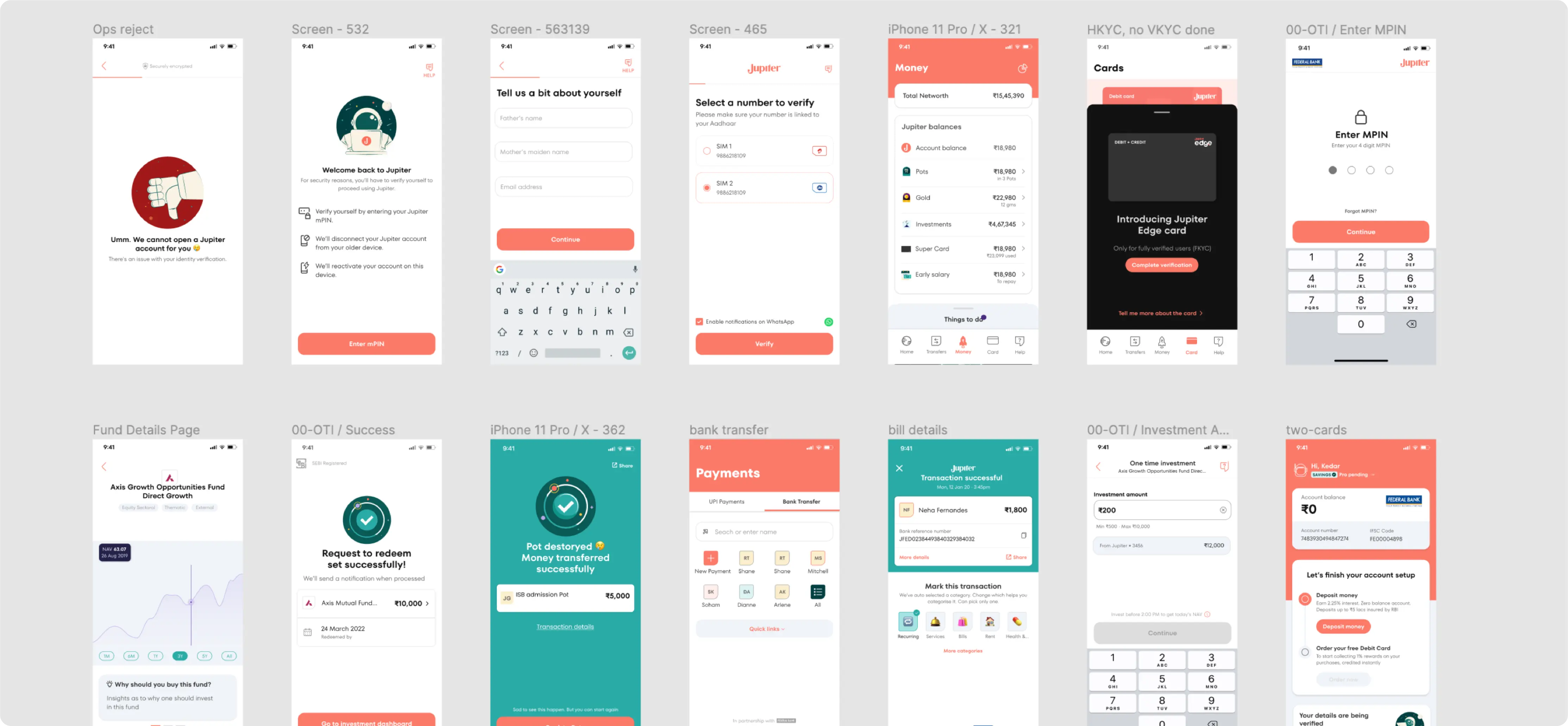
I used Figma to collect screenshots of all the components used in the actual interface and organized them into three categories:
- Atoms: colors, typography, and iconography
- Components: the reducible, simplest components, like buttons or tags
- Molecules: more complex components that often contain atoms
What did I learn? #
We got a few different benefits out of conducting this audit:
- The process of discussing quality bars across the design and engineering teams helped us understand each other, our constraints, processes, and build a more collaborative way of working.
- We need unified documentation that can be shared across teams, with more thought toward guidelines for components. This will help us make improvements to the reusability/connectedness of our components.
- We need a defined design direction, including design principles, so designers know how to make hard decisions.
- We need someone to be accountable for design system process and documentation.
- Furthermore, we need to have a plan to make visual updates before we fall behind competitors (which rests on having a direction and better documentation).
- We needed a more robust way of handling light/dark mode, as dark mode support was non-existent.
Foundation #
Foundations are the visual elements needed to create engaging end-to-end user experiences. They were created as the building blocks of all user interface elements and should be used as blueprints that all components and layouts are created from. This includes guidance on iconography, typography, layout and structure.
Colors #
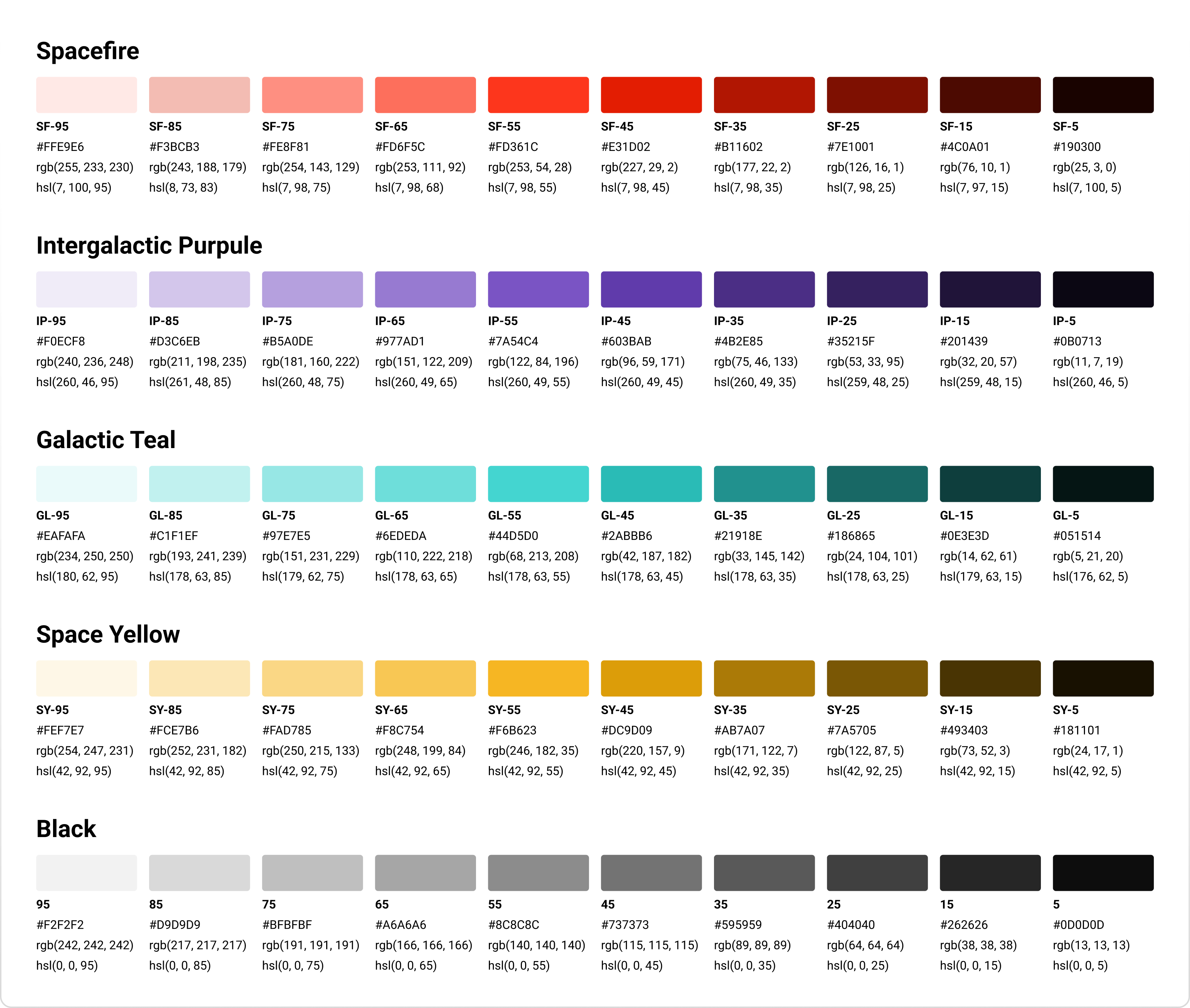
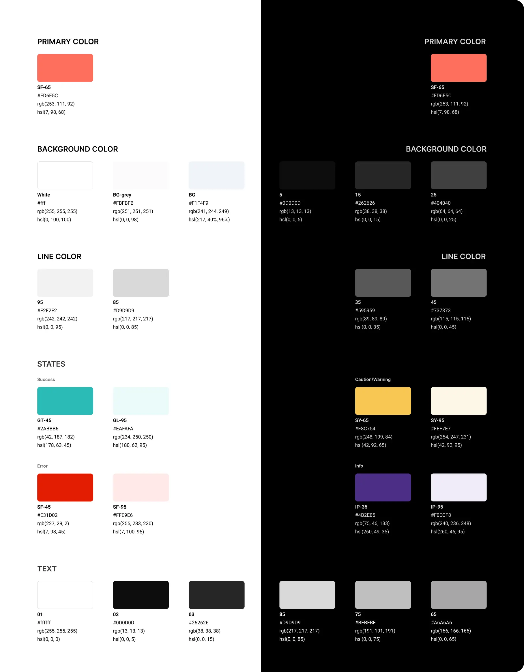
Unifies the brand while bringing accessibility and consistency to our digital experiences. Color supports the purpose of the content, communicating things like hierarchy of information, interactive states, and the difference between distinct elements.
We were using a set of colors, but actually on the App there were multiple shades of those colors were used.
- Colors used in gradients were not tokenized and were not used according to a system
- No Dark theme colors
- Multiple random colors were used without being added to the system
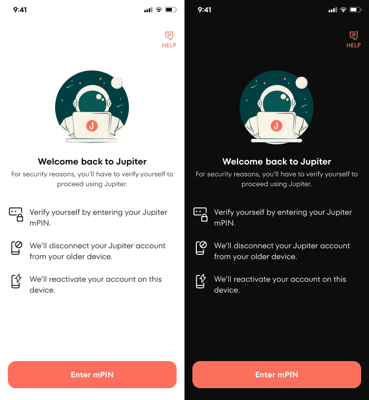
I decided to introduce the shade of each color. Now, we have a palette through which colors can be used for different purposes, and I was able to convert this to a Dark theme.
Typography #
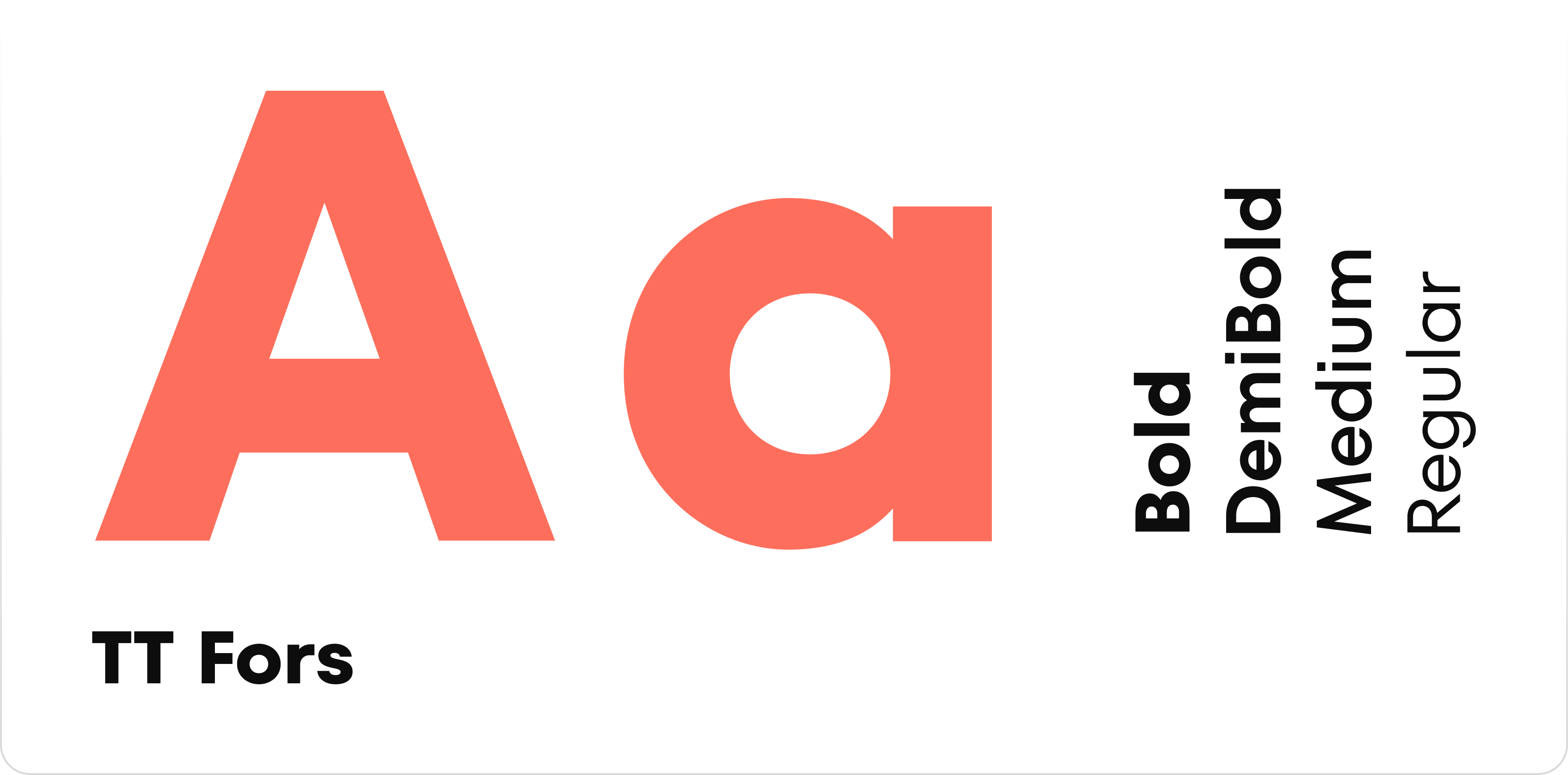
Typography organizes content and creates hierarchies. It brings consistency to experiences and extends the brand presence across web properties. We were using TT Fors for our website as well as App. This looked clean and crisp, and updates weren’t needed.
Spacing #
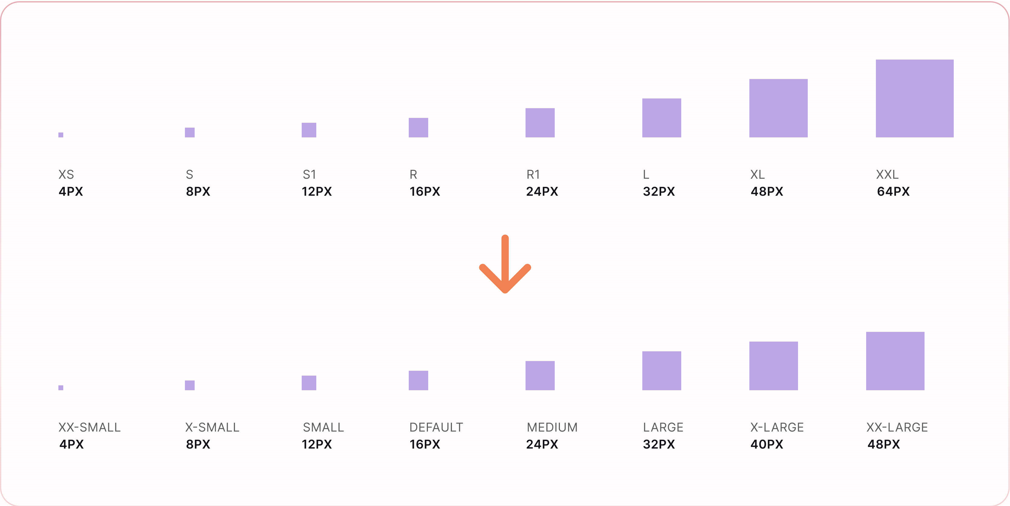
Spacers are visual cues used to define fixed amounts of space between elements. They make it easy for designers to maintain consistent spacing across components and patterns, as well as simplify the handoff process between designers and developers. Consistent spacing helps maintain balance and rhythm across the system This needed upgrade
- The current system had a mix of 4-point and 8-point spacing system, and this made the visuals on the page inconsistent.
- The naming is also inconsistent
I updated the spacing with the mostly used 8-point system with 4px & 12px being the exception
Iconography #
Icons are small visual representations that help us depict a variety of ideas, technologies, and interactions. Icons should be used purposefully to maximize comprehension and reduce cognitive load when you need to call attention to a particular action, command, or section. Use them infrequently – if you’re questioning an icon’s use, it probably doesn’t need to be used at all. This needed attention.
- Many of the icons weren’t used in a frame
- Nomenclature of the icons were not defined properly
- Random size icons were used by the designers
- Spacing wasn’t being followed
Layout #
A Grid is a group of columns that organize layouts and allow content to scale responsively based on screen size. They provide structure to pages and ensure optimal viewing experiences.
Not much is updated here, earlier iPhone 12 art board (375 * 812) was used which is now updated to a widely used 360*640 one as odd dimensions made it difficult for us to adjust elements on the page
Components #
Components are interactive building blocks of our design system. Each component was created to meet a specific UI and accessibility need. Components should be used harmoniously together in the same space to create more intuitive user interfaces and experiences. Let’s take a look at some of them in a bit more detail.
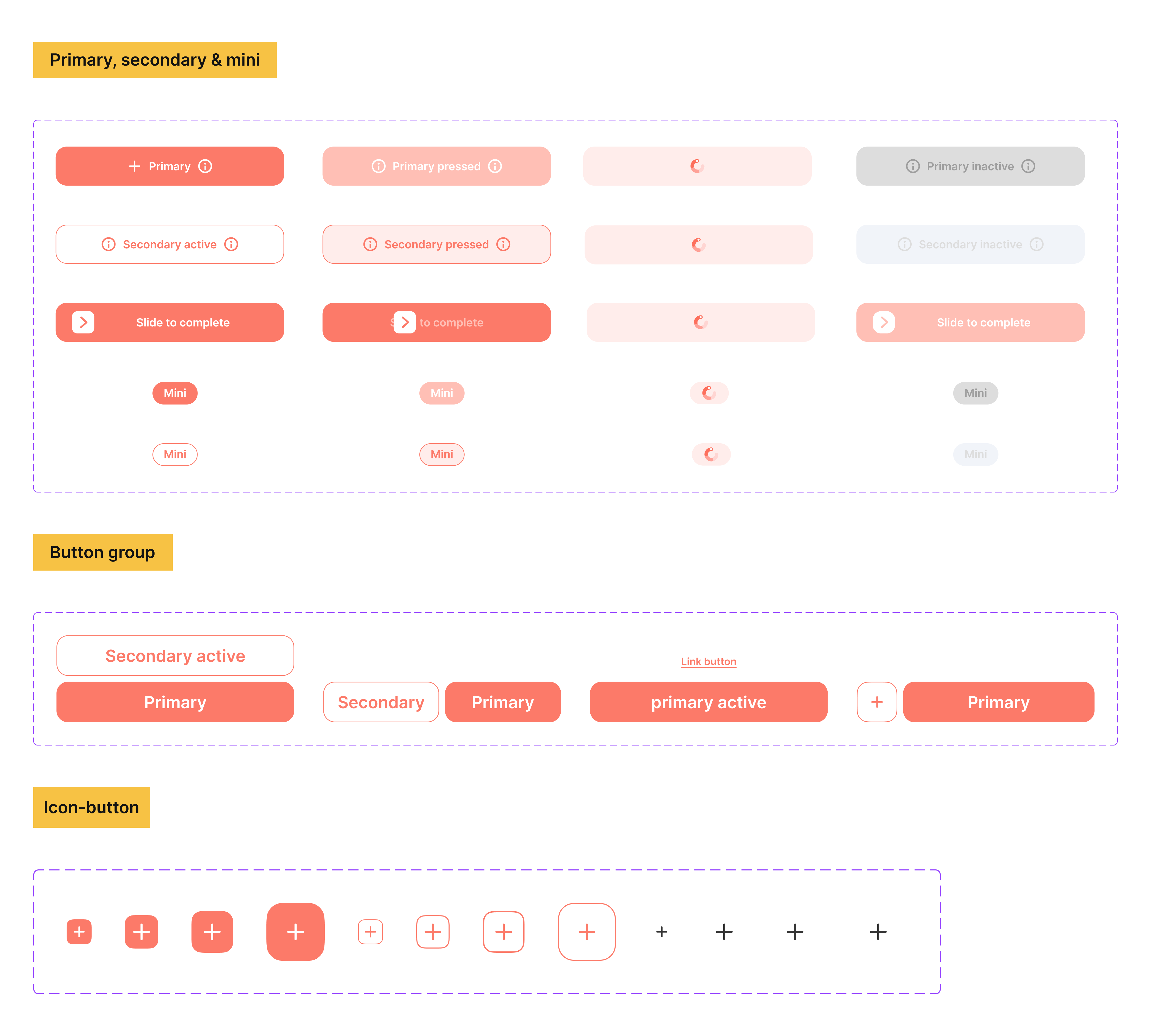
Button #
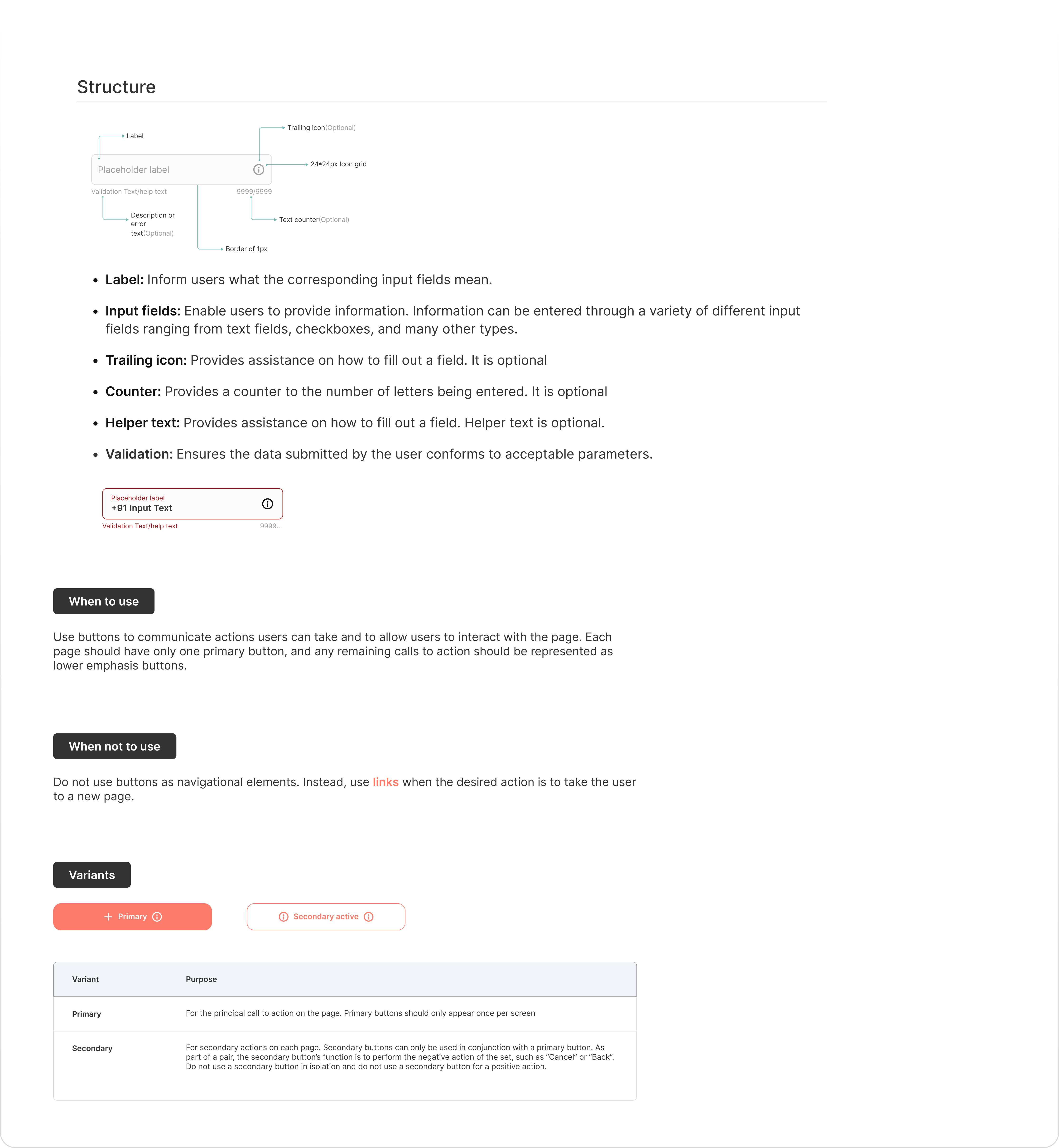
Buttons are clickable elements that are used to trigger actions. They communicate calls to action to the user and allow users to interact with pages in a variety of ways. Button labels express what action will occur when the user interacts with it. Multiple variants of this component were missing, and some new properties were added now for future-proffing.
Form #
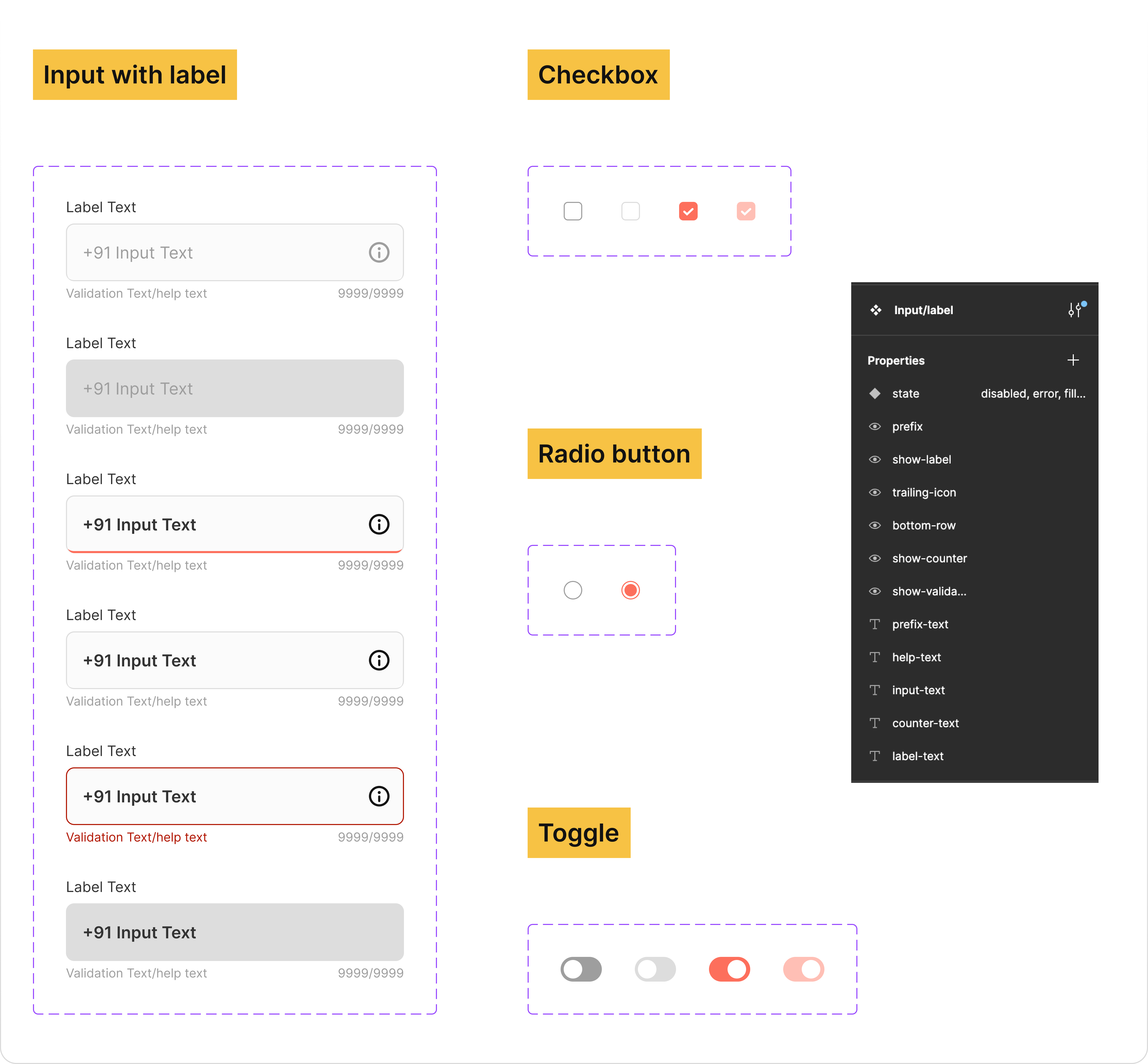
Forms are used for submitting data, so be as concise as possible when designing. Keep it short. Think about each field and what value the data will provide. What do you gain by collecting this information? Begin by asking:
- Is this a piece of information that is valuable to us?
- Is this a piece of information that is so valuable that it’s worth preventing the user from continuing if they choose not to provide it?
This component was the most inconsistent one. During the audit, I found at least 4–5 different visual versions of it. Multiple new properties were added with new Figma component configurable feature.
Other components #
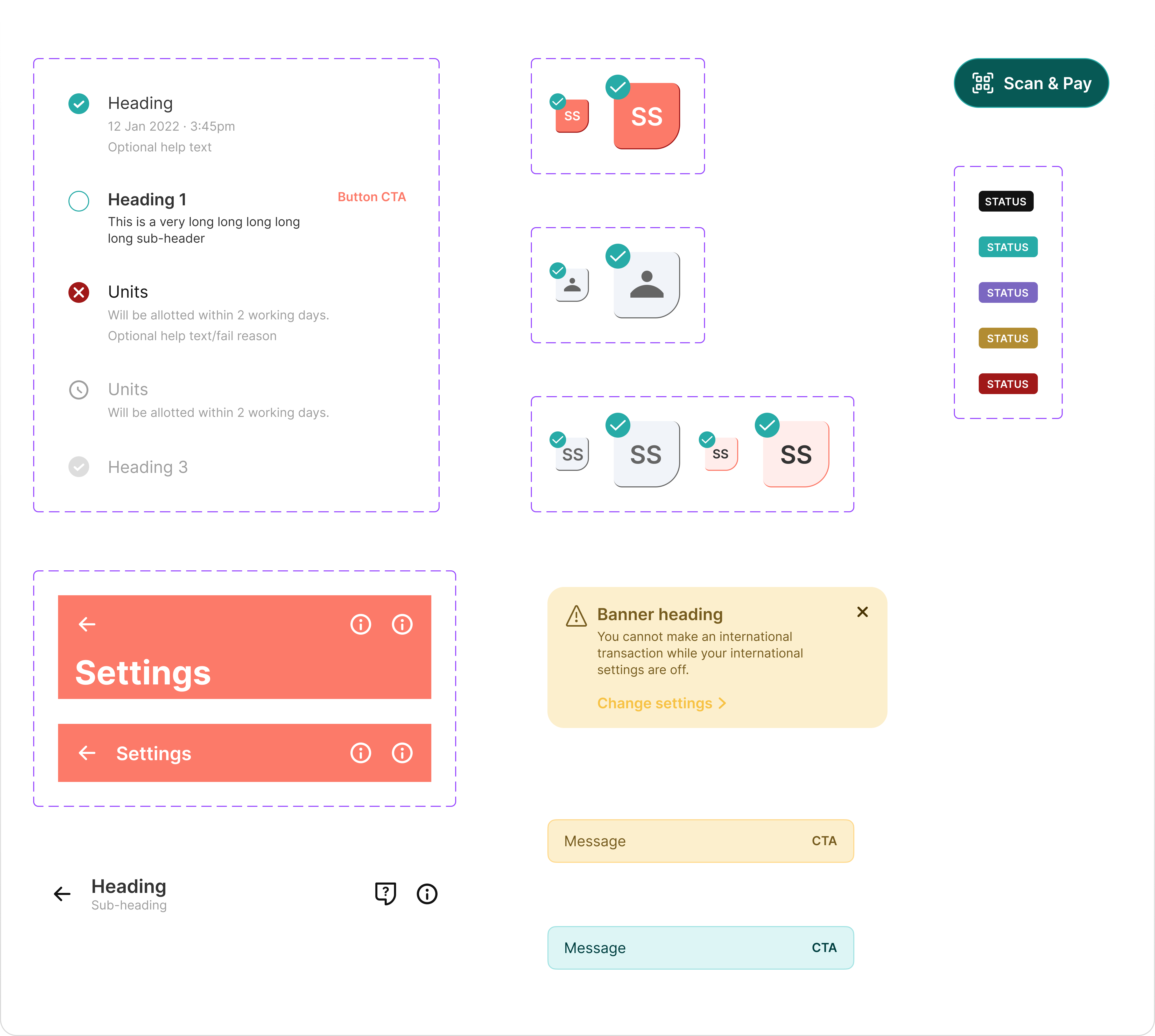
Design systems are complex, and I’ve only scratched the surface of components that have been built for Europa 2.0 up to this point. I just wanted to show a few of the other components that I’ve done so far.
Documentation #
The purpose of this is to make sure that contributors add to the guide clearly and cohesively that reflects a brand’s style and ensures brand consistency for everything from writing to design. It also supports marketing initiatives, as everything in the documentation focuses on company values and goals.
Documentation and standards are what separate a pattern library from a true design system.
This is a space where you define what should be used “When” and “How”
